
Voyage
Voyage
Visual Identity System
Creative Direction
Challenge
A bar with a rich concept and no identity to match. Aviation-inspired, luxury-leaning, social at its core. Nothing existed visually to communicate any of it.
outcome
A complete brand identity built around the tension between adventure and stillness. Warm, premium, and unmistakably Voyage.
Client
Hotel Boundary Ltd.
Industry
F&B
Year
2023
project brief
Voyage Bar is an aviation-inspired urban slow bar located in the heart of Yangon, Myanmar, operating under Hotel Boundary Ltd. The concept blends luxury and social energy, offering craft cocktails and fine liquors to both alcohol and non-alcoholic enthusiasts. The brief was to build a complete visual identity from scratch that could capture the brand's dual nature: the spirit of travel and exploration on one hand, warmth and community on the other. The identity also needed to maintain a visual connection with the parent brand, Boundary Residence Hotel.
What the icon stands for
What our iconstands for
The mark combines two symbols: a jet engine, representing the power, speed, and spirit of travel that sits at the heart of the Voyage concept, and a social hangout symbol, representing connection and community, the reason people actually come through the door.
Together they form a single icon that reads as both destination and experience, a place where people come to journey and to belong.
The mark combines three overlapping ellipses, each colour representing one of STS's three age groups, nursery through to year two. The shape is built on the letterform S and draws from the visual metaphor of stacked stepping stones, which is where the school gets its name.
The mark combines two symbols: a jet engine, representing the power, speed, and spirit of travel that sits at the heart of the Voyage concept, and a social hangout symbol, representing connection and community, the reason people actually come through the door.
Together they form a single icon that reads as both destination and experience, a place where people come to journey and to belong.

Jet Engine of an airplane
+

Friends Hanging Out
=

Jet Engine of an airplane
+
Friends Hanging Out
=
Jet Engine of an airplane
+
Friends Hanging Out
Scalable Identity System
The Voyage identity was built with four lockups to cover every context: horizontal, primary, icon-only, and wordmark. Each was designed to hold up from a cocktail menu to a billboard, from a social post to venue signage. Rather than forcing one version into every space, the system gives each application the right tool without ever compromising the brand.
Logo Variations
Primary Lockup

Icon-Only Lockup
Horizontal Lockup

Word Mark

color palette
#823439
#823439
#823439
#823439
#823439
#823439
Tint & Shade
20% lightness increments
Typography
The primary typeface is a custom display font, drawn from Abril Fatface as a starting point but shaped into something specific to the brand. The thick, high-contrast serifs carry the premium weight the brand needed while giving it a visual character that no off-the-shelf font could deliver. Body copy is set in Source Serif, which grounds the system with legibility and a quiet editorial quality that lets the display type do the talking.
primary type face
Cooper Hewitt
Hierarchy & Weight
Aa
Thin
Aa
Regular
Aa
Semi-Bold
Aa
Heavy

Primary Lockup

Horizontal Lockup

Icon-Only Lockup

Word Mark
Scalable Identity System
The Voyage identity was built with four lockups to cover every context: horizontal, primary, icon-only, and wordmark. Each was designed to hold up from a cocktail menu to a billboard, from a social post to venue signage. Rather than forcing one version into every space, the system gives each application the right tool without ever compromising the brand.
Logo Variations
Primary Lockup
Icon-only
Vertical Lockup
Word Mark
color palette
#823439
#823439
#823439
#823439
#823439
#823439
Tint & Shade
20% lightness increments
Typography
The primary typeface is a custom display font, drawn from Abril Fatface as a starting point but shaped into something specific to the brand. The thick, high-contrast serifs carry the premium weight the brand needed while giving it a visual character that no off-the-shelf font could deliver. Body copy is set in Source Serif, which grounds the system with legibility and a quiet editorial quality that lets the display type do the talking.
primary type face
Cooper Hewitt
Hierarchy & Weight
Aa
Thin
Aa
Regular
Aa
Semi-Bold
Aa
Heavy
Scalable Identity System
The Voyage identity was built with four lockups to cover every context: horizontal, primary, icon-only, and wordmark. Each was designed to hold up from a cocktail menu to a billboard, from a social post to venue signage. Rather than forcing one version into every space, the system gives each application the right tool without ever compromising the brand.
Logo Variations
Primary Lockup
Icon-only
Vertical Lockup
Word Mark
color palette
#823439
#823439
#823439
#823439
#823439
#823439
Tint & Shade
20% lightness increments
Typography
The primary typeface is a custom display font, drawn from Abril Fatface as a starting point but shaped into something specific to the brand. The thick, high-contrast serifs carry the premium weight the brand needed while giving it a visual character that no off-the-shelf font could deliver. Body copy is set in Source Serif, which grounds the system with legibility and a quiet editorial quality that lets the display type do the talking.
primary type face
Cooper Hewitt
Hierarchy & Weight
Aa
Thin
Aa
Regular
Aa
Semi-Bold
Aa
Heavy
Scalable Identity System
The Voyage identity was built with four lockups to cover every context: horizontal, primary, icon-only, and wordmark. Each was designed to hold up from a cocktail menu to a billboard, from a social post to venue signage. Rather than forcing one version into every space, the system gives each application the right tool without ever compromising the brand.
Logo Variations
Primary Lockup
Icon-only
Vertical Lockup
Word Mark
color palette
#823439
#823439
#823439
#823439
#823439
#823439
Tint & Shade
20% lightness increments
Typography
The primary typeface is a custom display font, drawn from Abril Fatface as a starting point but shaped into something specific to the brand. The thick, high-contrast serifs carry the premium weight the brand needed while giving it a visual character that no off-the-shelf font could deliver. Body copy is set in Source Serif, which grounds the system with legibility and a quiet editorial quality that lets the display type do the talking.
primary type face
Cooper Hewitt
Hierarchy & Weight
Aa
Thin
Aa
Regular
Aa
Semi-Bold
Aa
Heavy
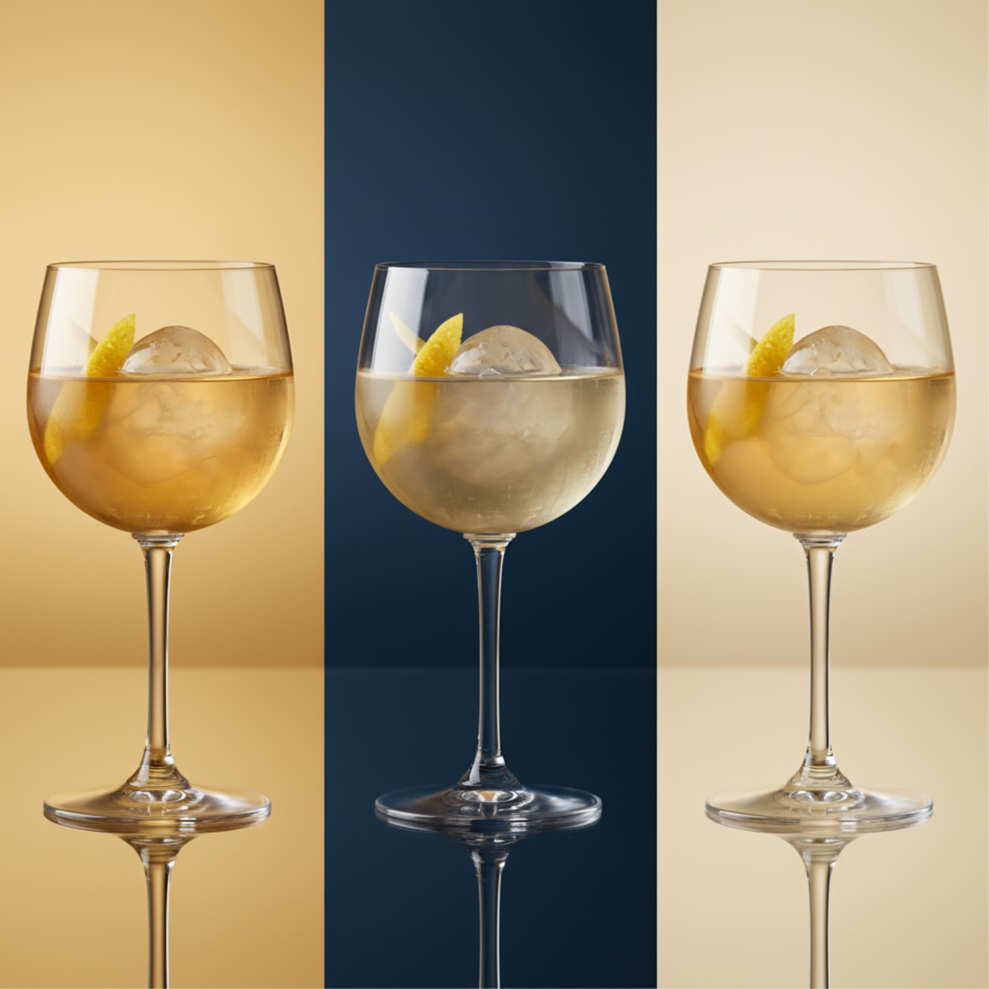
Brand Patterns

Scalable Identity System
The Voyage identity was built with four lockups to cover every context: horizontal, primary, icon-only, and wordmark. Each was designed to hold up from a cocktail menu to a billboard, from a social post to venue signage. Rather than forcing one version into every space, the system gives each application the right tool without ever compromising the brand.
Logo Variations
Primary Lockup
Icon-only
Vertical Lockup
Word Mark
Color
The palette was built around warmth, luxury, and a sense of the exotic. Gold sits at the center, referencing the aviation world's premium associations and the warmth of soft ambient lighting. Deep navy grounds the palette with authority and depth. Cream brings balance, preventing the combination from feeling heavy, and giving the brand room to breathe across print and digital applications.
color palette
Tints & Shades
20% lightness increments
Typography
The primary typeface is a custom display font, drawn from Abril Fatface as a starting point but shaped into something specific to the brand. The thick, high-contrast serifs carry the premium weight the brand needed while giving it a visual character that no off-the-shelf font could deliver. Body copy is set in Source Serif, which grounds the system with legibility and a quiet editorial quality that lets the display type do the talking.
primary type face
Cooper Hewitt
Hierarchy & Weight
Aa
Thin
Aa
Regular
Aa
Semi-Bold
Aa
Heavy
Scalable Identity System
The Voyage identity was built with four lockups to cover every context: horizontal, primary, icon-only, and wordmark. Each was designed to hold up from a cocktail menu to a billboard, from a social post to venue signage. Rather than forcing one version into every space, the system gives each application the right tool without ever compromising the brand.
Logo Variations
Primary Lockup
Icon-only
Vertical Lockup
Word Mark
Color
The palette was built around warmth, luxury, and a sense of the exotic. Gold sits at the center, referencing the aviation world's premium associations and the warmth of soft ambient lighting. Deep navy grounds the palette with authority and depth. Cream brings balance, preventing the combination from feeling heavy, and giving the brand room to breathe across print and digital applications.
color palette
#BF8B30
#283039
#FFF1C9
Tints & Shades
20% lightness increments
Typography
The primary typeface is a custom display font, drawn from Abril Fatface as a starting point but shaped into something specific to the brand. The thick, high-contrast serifs carry the premium weight the brand needed while giving it a visual character that no off-the-shelf font could deliver. Body copy is set in Source Serif, which grounds the system with legibility and a quiet editorial quality that lets the display type do the talking.
primary type face
Cooper Hewitt
Hierarchy & Weight
Aa
Thin
Aa
Regular
Aa
Semi-Bold
Aa
Heavy
Scalable Identity System
The Voyage identity was built with four lockups to cover every context: horizontal, primary, icon-only, and wordmark. Each was designed to hold up from a cocktail menu to a billboard, from a social post to venue signage. Rather than forcing one version into every space, the system gives each application the right tool without ever compromising the brand.
Logo Variations
Primary Lockup
Icon-only
Vertical Lockup
Word Mark
Color
The palette was built around warmth, luxury, and a sense of the exotic. Gold sits at the center, referencing the aviation world's premium associations and the warmth of soft ambient lighting. Deep navy grounds the palette with authority and depth. Cream brings balance, preventing the combination from feeling heavy, and giving the brand room to breathe across print and digital applications.
color palette
#823439
#823439
#823439
Tints & Shades
20% lightness increments
Typography
The primary typeface is a custom display font, drawn from Abril Fatface as a starting point but shaped into something specific to the brand. The thick, high-contrast serifs carry the premium weight the brand needed while giving it a visual character that no off-the-shelf font could deliver. Body copy is set in Source Serif, which grounds the system with legibility and a quiet editorial quality that lets the display type do the talking.
primary type face
Cooper Hewitt
Hierarchy & Weight
Aa
Thin
Aa
Regular
Aa
Semi-Bold
Aa
Heavy


Typographic Variations
Color
The palette was built around warmth, luxury, and a sense of the exotic. Gold sits at the center, referencing the aviation world's premium associations and the warmth of soft ambient lighting. Deep navy grounds the palette with authority and depth. Cream brings balance, preventing the combination from feeling heavy, and giving the brand room to breathe across print and digital applications.
Logo Variations
Primary Lockup
Icon-only
Vertical Lockup
Word Mark
Color
The palette was built around warmth, luxury, and a sense of the exotic. Gold sits at the center, referencing the aviation world's premium associations and the warmth of soft ambient lighting. Deep navy grounds the palette with authority and depth. Cream brings balance, preventing the combination from feeling heavy, and giving the brand room to breathe across print and digital applications.
color palette
#823439
#823439
#823439
#823439
#823439
#823439
Tint & Shade
20% lightness increments
Typography
The primary typeface is a custom display font, drawn from Abril Fatface as a starting point but shaped into something specific to the brand. The thick, high-contrast serifs carry the premium weight the brand needed while giving it a visual character that no off-the-shelf font could deliver. Body copy is set in Source Serif, which grounds the system with legibility and a quiet editorial quality that lets the display type do the talking.
primary type face
Hierarchy & Weight
Color
The palette was built around warmth, luxury, and a sense of the exotic. Gold sits at the center, referencing the aviation world's premium associations and the warmth of soft ambient lighting. Deep navy grounds the palette with authority and depth. Cream brings balance, preventing the combination from feeling heavy, and giving the brand room to breathe across print and digital applications.
Logo Variations
Primary Lockup
Icon-only
Vertical Lockup
Word Mark
Color
The palette was built around warmth, luxury, and a sense of the exotic. Gold sits at the center, referencing the aviation world's premium associations and the warmth of soft ambient lighting. Deep navy grounds the palette with authority and depth. Cream brings balance, preventing the combination from feeling heavy, and giving the brand room to breathe across print and digital applications.
color palette
#823439
#823439
#823439
#823439
#823439
#823439
Tint & Shade
20% lightness increments
Typography
The primary typeface is a custom display font, drawn from Abril Fatface as a starting point but shaped into something specific to the brand. The thick, high-contrast serifs carry the premium weight the brand needed while giving it a visual character that no off-the-shelf font could deliver. Body copy is set in Source Serif, which grounds the system with legibility and a quiet editorial quality that lets the display type do the talking.
primary type face
Source Serif Pro
Hierarchy & Weight
Aa
Thin
Aa
Regular
Aa
Semi-Bold
Aa
Heavy
Color
The palette was built around warmth, luxury, and a sense of the exotic. Gold sits at the center, referencing the aviation world's premium associations and the warmth of soft ambient lighting. Deep navy grounds the palette with authority and depth. Cream brings balance, preventing the combination from feeling heavy, and giving the brand room to breathe across print and digital applications.
Logo Variations
Primary Lockup
Icon-only
Vertical Lockup
Word Mark
Color
The palette was built around warmth, luxury, and a sense of the exotic. Gold sits at the center, referencing the aviation world's premium associations and the warmth of soft ambient lighting. Deep navy grounds the palette with authority and depth. Cream brings balance, preventing the combination from feeling heavy, and giving the brand room to breathe across print and digital applications.
color palette
#823439
#823439
#823439
#823439
#823439
#823439
Tint & Shade
20% lightness increments
Typography
The primary typeface is a custom display font, drawn from Abril Fatface as a starting point but shaped into something specific to the brand. The thick, high-contrast serifs carry the premium weight the brand needed while giving it a visual character that no off-the-shelf font could deliver. Body copy is set in Source Serif, which grounds the system with legibility and a quiet editorial quality that lets the display type do the talking.
primary type face
Source Serif Pro
Hierarchy & Weight
Aa
Thin
Aa
Regular
Aa
Semi-Bold
Aa
Heavy
How I Built It
How I Built It
LUXURY
CONTEMPORARY
PREMIUM
COZY
EXQUISITE
RUSTIC
WARM
VINTAGE
AVIATION
SERENE
ADVENTUROUS
JOURNEY
CRAFT
SOPHISTICATED
COLONIAL
TIMELESS
CURATED
ELEGANT
LIVELY
CELEBRATION
GOURMET
SOCIAL
LUXURY
CONTEMPORARY
PREMIUM
COZY
EXQUISITE
RUSTIC
WARM
VINTAGE
AVIATION
SERENE
ADVENTUROUS
JOURNEY
CRAFT
SOPHISTICATED
COLONIAL
TIMELESS
CURATED
ELEGANT
LIVELY
CELEBRATION
GOURMET
SOCIAL
LUXURY
CONTEMPORARY
PREMIUM
COZY
EXQUISITE
RUSTIC
WARM
VINTAGE
AVIATION
SERENE
ADVENTUROUS
JOURNEY
CRAFT
SOPHISTICATED
COLONIAL
TIMELESS
CURATED
ELEGANT
LIVELY
CELEBRATION
GOURMET
SOCIAL
Mindmapping
Before any mark was drawn, the process started with a mind map to unpack everything the brand needed to communicate. Playfulness, safety, growth, accessibility. That thinking shaped the direction before a single line hit paper.
Before any mark was drawn, the process started with a mind map to unpack everything the brand needed to communicate. Playfulness, safety, growth, accessibility. That thinking shaped the direction before a single line hit paper.
How i built it
Ideation + Early Sketches
Over twenty symbol directions were explored before committing to one. Compass roses, star forms, propellers, molecular shapes, abstract navigation marks, each rooted in the brand's aviation and exploration brief but pushing toward very different visual outcomes. The final mark won because it carried the tension the brand¡¡ needed: structured enough to feel premium, organic enough to feel welcoming.
LUXURY
CONTEMPORARY
PREMIUM
COZY
EXQUISITE
RUSTIC
WARM
VINTAGE
AVIATION
SERENE
ADVENTUROUS
JOURNEY
CRAFT
SOPHISTICATED
COLONIAL
TIMELESS
CURATED
ELEGANT
LIVELY
CELEBRATION
GOURMET
SOCIAL
Mindmapping
Before any mark was drawn, the process started with a mind map to unpack everything the brand needed to communicate. Playfulness, safety, growth, accessibility. That thinking shaped the direction before a single line hit paper.
How i built it
Ideation + Early Sketches
Over twenty symbol directions were explored before committing to one. Compass roses, star forms, propellers, molecular shapes, abstract navigation marks, each rooted in the brand's aviation and exploration brief but pushing toward very different visual outcomes. The final mark won because it carried the tension the brand¡¡ needed: structured enough to feel premium, organic enough to feel welcoming.
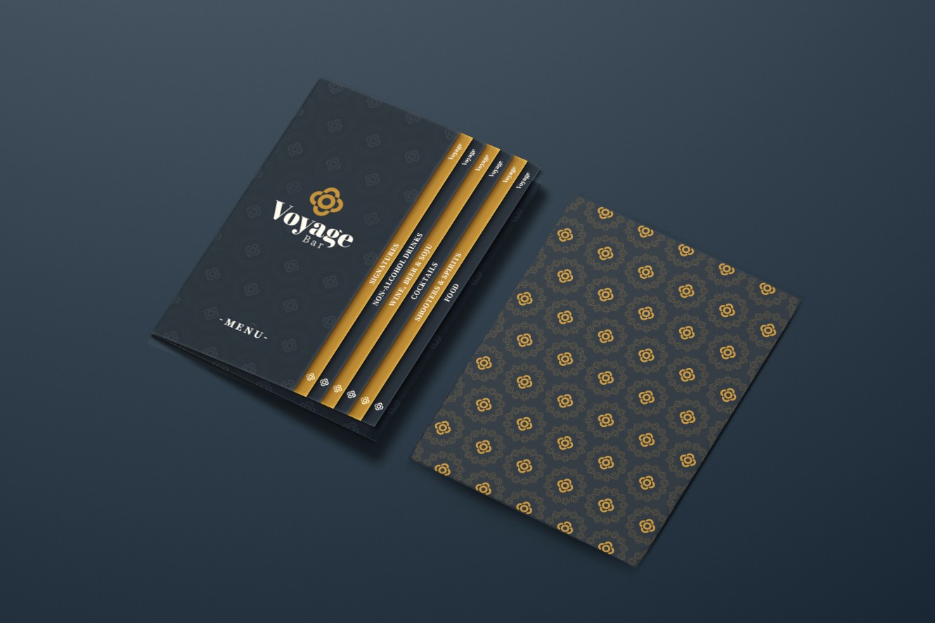
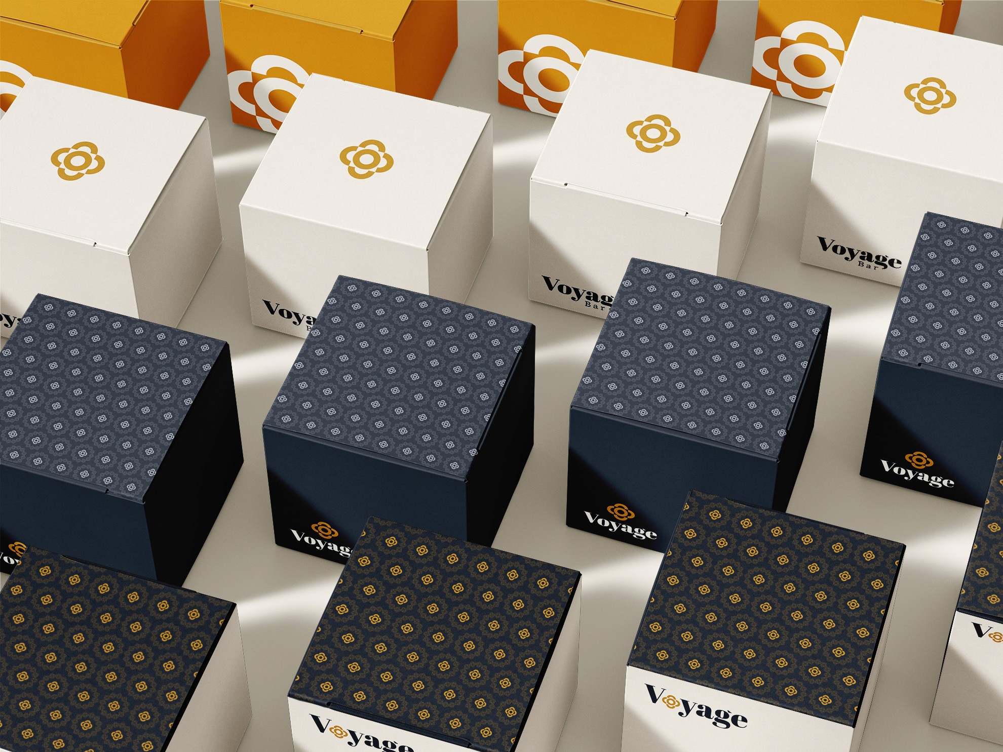
logo in use
logo in use



final thoughts
Voyage was a brief that could have gone in a dozen directions. The aviation thread alone opened up a wide exploration, and getting from that first mindmap to a mark that felt both adventurous and settled took more rounds than expected. The identity that came out of it holds that tension well. It works on a menu, on a glass, and on the wall of a bar where people are having the kind of night they'll talk about later.
Have a project in mind?
