
Cafe Boundary
Cafe Boundary
Visual Identity System
Creative Direction
Challenge
The concept was ready: coffee, community, and a bit of good fortune. Nothing visual existed to carry it onto a cup, a wall, or a menu.
outcome
A clover-and-script identity that makes the space feel like a lucky find. One system, every surface, from takeaway cup to wall mural.
Client
Hotel Boundary Ltd.
Industry
F&B
Year
2024
project brief
Cafe Boundary is a contemporary cafe positioned as a space for everyone, whether you're studying, catching up, or on a first date. The concept balances quality coffee with a welcoming, aesthetically considered atmosphere, rooted in the idea of good fortune and genuine connection. The brief was to build a complete visual identity from scratch that could communicate all of that without feeling generic or overly designed.
What the icon stands for
What our iconstands for
The mark combines three elements: a clover, representing good fortune and the natural world; vine-like fluid script lettering, representing growth, connection, and creativity; and a heart shape, woven into the clover leaf to represent inclusivity and the simple joy of a good coffee moment. Together they form a logo that reads as organic and welcoming without losing visual sharpness.
The four-leaf version used in the decorative lockup adds a fourth meaning: the cafe itself, the missing piece that connects quality, comfort, and community into a single experience.
The mark combines three overlapping ellipses, each colour representing one of STS's three age groups, nursery through to year two. The shape is built on the letterform S and draws from the visual metaphor of stacked stepping stones, which is where the school gets its name.
The mark combines three elements: a clover, representing good fortune and the natural world; vine-like fluid script lettering, representing growth, connection, and creativity; and a heart shape, woven into the clover leaf to represent inclusivity and the simple joy of a good coffee moment. Together they form a logo that reads as organic and welcoming without losing visual sharpness.
The four-leaf version used in the decorative lockup adds a fourth meaning: the cafe itself, the missing piece that connects quality, comfort, and community into a single experience.

Clover
+

Vines
+

Heart Shape
=

Clover
+
Vines
+
Heart Shape
=
Clover
+
Vines
+
Heart Shape
Scalable Identity System
The Cafe Boundary identity was built with four lockups to cover every context: primary, icon-only, horizontal, and decorative. The decorative lockup, with four heart-shaped clovers woven through the lettering, is designed as a statement piece for large-scale surfaces and wall art. Each version serves a specific purpose so the brand never has to be forced into a space it wasn't built for.
Logo Variations
Primary Lockup
Icon-Only Lockup
Secondary Lockup

Decorative Lockup

color palette
#823439
#823439
#823439
#823439
#823439
#823439
Tint & Shade
20% lightness increments
Typography
The typeface is the identity. Fluid, script-driven letterforms with vine-like flourishes carry the brand's personality directly into the wordmark. It reads as handcrafted without feeling informal, striking the balance between a coffee shop that takes its product seriously and a space that doesn't take itself too seriously.
primary type face
Cooper Hewitt
Hierarchy & Weight
Aa
Thin
Aa
Regular
Aa
Semi-Bold
Aa
Heavy

Primary Lockup

Symbol Explained

Secondary Lockup

Icon-Only Lockup

Decorative Lockup
Scalable Identity System
The Cafe Boundary identity was built with four lockups to cover every context: primary, icon-only, horizontal, and decorative. The decorative lockup, with four heart-shaped clovers woven through the lettering, is designed as a statement piece for large-scale surfaces and wall art. Each version serves a specific purpose so the brand never has to be forced into a space it wasn't built for.
Logo Variations
Primary Lockup
Icon-only
Vertical Lockup
Word Mark
color palette
#823439
#823439
#823439
#823439
#823439
#823439
Tint & Shade
20% lightness increments
Typography
The typeface is the identity. Fluid, script-driven letterforms with vine-like flourishes carry the brand's personality directly into the wordmark. It reads as handcrafted without feeling informal, striking the balance between a coffee shop that takes its product seriously and a space that doesn't take itself too seriously.
primary type face
Cooper Hewitt
Hierarchy & Weight
Aa
Thin
Aa
Regular
Aa
Semi-Bold
Aa
Heavy
Scalable Identity System
The Cafe Boundary identity was built with four lockups to cover every context: primary, icon-only, horizontal, and decorative. The decorative lockup, with four heart-shaped clovers woven through the lettering, is designed as a statement piece for large-scale surfaces and wall art. Each version serves a specific purpose so the brand never has to be forced into a space it wasn't built for.
Logo Variations
Primary Lockup
Icon-only
Vertical Lockup
Word Mark
color palette
#823439
#823439
#823439
#823439
#823439
#823439
Tint & Shade
20% lightness increments
Typography
The typeface is the identity. Fluid, script-driven letterforms with vine-like flourishes carry the brand's personality directly into the wordmark. It reads as handcrafted without feeling informal, striking the balance between a coffee shop that takes its product seriously and a space that doesn't take itself too seriously.
primary type face
Cooper Hewitt
Hierarchy & Weight
Aa
Thin
Aa
Regular
Aa
Semi-Bold
Aa
Heavy
Scalable Identity System
The Cafe Boundary identity was built with four lockups to cover every context: primary, icon-only, horizontal, and decorative. The decorative lockup, with four heart-shaped clovers woven through the lettering, is designed as a statement piece for large-scale surfaces and wall art. Each version serves a specific purpose so the brand never has to be forced into a space it wasn't built for.
Logo Variations
Primary Lockup
Icon-only
Vertical Lockup
Word Mark
color palette
#823439
#823439
#823439
#823439
#823439
#823439
Tint & Shade
20% lightness increments
Typography
The typeface is the identity. Fluid, script-driven letterforms with vine-like flourishes carry the brand's personality directly into the wordmark. It reads as handcrafted without feeling informal, striking the balance between a coffee shop that takes its product seriously and a space that doesn't take itself too seriously.
primary type face
Cooper Hewitt
Hierarchy & Weight
Aa
Thin
Aa
Regular
Aa
Semi-Bold
Aa
Heavy


Scalable Identity System
The Cafe Boundary identity was built with four lockups to cover every context: primary, icon-only, horizontal, and decorative. The decorative lockup, with four heart-shaped clovers woven through the lettering, is designed as a statement piece for large-scale surfaces and wall art. Each version serves a specific purpose so the brand never has to be forced into a space it wasn't built for.
Logo Variations
Primary Lockup
Icon-only
Vertical Lockup
Word Mark
Color
The palette leads with deep forest green, grounded in nature and chosen to feel both sophisticated and inviting. It avoids the trap of looking like a generic health brand by pairing the green with cream tones that feel warm and considered rather than clinical. The two-color system gives the brand flexibility across backgrounds without ever losing its character.
color palette
Tints & Shades
20% lightness increments
Typography
The typeface is the identity. Fluid, script-driven letterforms with vine-like flourishes carry the brand's personality directly into the wordmark. It reads as handcrafted without feeling informal, striking the balance between a coffee shop that takes its product seriously and a space that doesn't take itself too seriously.
primary type face
Cooper Hewitt
Hierarchy & Weight
Aa
Thin
Aa
Regular
Aa
Semi-Bold
Aa
Heavy
Scalable Identity System
The Cafe Boundary identity was built with four lockups to cover every context: primary, icon-only, horizontal, and decorative. The decorative lockup, with four heart-shaped clovers woven through the lettering, is designed as a statement piece for large-scale surfaces and wall art. Each version serves a specific purpose so the brand never has to be forced into a space it wasn't built for.
Logo Variations
Primary Lockup
Icon-only
Vertical Lockup
Word Mark
Color
The palette leads with deep forest green, grounded in nature and chosen to feel both sophisticated and inviting. It avoids the trap of looking like a generic health brand by pairing the green with cream tones that feel warm and considered rather than clinical. The two-color system gives the brand flexibility across backgrounds without ever losing its character.
color palette
#00603A
#48B748
#E7F9DC
Tints & Shades
20% lightness increments
Typography
The typeface is the identity. Fluid, script-driven letterforms with vine-like flourishes carry the brand's personality directly into the wordmark. It reads as handcrafted without feeling informal, striking the balance between a coffee shop that takes its product seriously and a space that doesn't take itself too seriously.
primary type face
Cooper Hewitt
Hierarchy & Weight
Aa
Thin
Aa
Regular
Aa
Semi-Bold
Aa
Heavy
Scalable Identity System
The Cafe Boundary identity was built with four lockups to cover every context: primary, icon-only, horizontal, and decorative. The decorative lockup, with four heart-shaped clovers woven through the lettering, is designed as a statement piece for large-scale surfaces and wall art. Each version serves a specific purpose so the brand never has to be forced into a space it wasn't built for.
Logo Variations
Primary Lockup
Icon-only
Vertical Lockup
Word Mark
Color
The palette leads with deep forest green, grounded in nature and chosen to feel both sophisticated and inviting. It avoids the trap of looking like a generic health brand by pairing the green with cream tones that feel warm and considered rather than clinical. The two-color system gives the brand flexibility across backgrounds without ever losing its character.
color palette
#823439
#823439
#823439
Tints & Shades
20% lightness increments
Typography
The typeface is the identity. Fluid, script-driven letterforms with vine-like flourishes carry the brand's personality directly into the wordmark. It reads as handcrafted without feeling informal, striking the balance between a coffee shop that takes its product seriously and a space that doesn't take itself too seriously.
primary type face
Cooper Hewitt
Hierarchy & Weight
Aa
Thin
Aa
Regular
Aa
Semi-Bold
Aa
Heavy


Typographic Variations
Color
The palette leads with deep forest green, grounded in nature and chosen to feel both sophisticated and inviting. It avoids the trap of looking like a generic health brand by pairing the green with cream tones that feel warm and considered rather than clinical. The two-color system gives the brand flexibility across backgrounds without ever losing its character.
Logo Variations
Primary Lockup
Icon-only
Vertical Lockup
Word Mark
Color
The palette leads with deep forest green, grounded in nature and chosen to feel both sophisticated and inviting. It avoids the trap of looking like a generic health brand by pairing the green with cream tones that feel warm and considered rather than clinical. The two-color system gives the brand flexibility across backgrounds without ever losing its character.
color palette
#823439
#823439
#823439
#823439
#823439
#823439
Tint & Shade
20% lightness increments
Typography
The typeface is the identity. Fluid, script-driven letterforms with vine-like flourishes carry the brand's personality directly into the wordmark. It reads as handcrafted without feeling informal, striking the balance between a coffee shop that takes its product seriously and a space that doesn't take itself too seriously.
primary type face
Hierarchy & Weight
Color
The palette leads with deep forest green, grounded in nature and chosen to feel both sophisticated and inviting. It avoids the trap of looking like a generic health brand by pairing the green with cream tones that feel warm and considered rather than clinical. The two-color system gives the brand flexibility across backgrounds without ever losing its character.
Logo Variations
Primary Lockup
Icon-only
Vertical Lockup
Word Mark
Color
The palette leads with deep forest green, grounded in nature and chosen to feel both sophisticated and inviting. It avoids the trap of looking like a generic health brand by pairing the green with cream tones that feel warm and considered rather than clinical. The two-color system gives the brand flexibility across backgrounds without ever losing its character.
color palette
#823439
#823439
#823439
#823439
#823439
#823439
Tint & Shade
20% lightness increments
Typography
The typeface is the identity. Fluid, script-driven letterforms with vine-like flourishes carry the brand's personality directly into the wordmark. It reads as handcrafted without feeling informal, striking the balance between a coffee shop that takes its product seriously and a space that doesn't take itself too seriously.
primary type face
L ubaline
Hierarchy & Weight
AA
Decorative
aa
Regular
Color
The palette leads with deep forest green, grounded in nature and chosen to feel both sophisticated and inviting. It avoids the trap of looking like a generic health brand by pairing the green with cream tones that feel warm and considered rather than clinical. The two-color system gives the brand flexibility across backgrounds without ever losing its character.
Logo Variations
Primary Lockup
Icon-only
Vertical Lockup
Word Mark
Color
The palette leads with deep forest green, grounded in nature and chosen to feel both sophisticated and inviting. It avoids the trap of looking like a generic health brand by pairing the green with cream tones that feel warm and considered rather than clinical. The two-color system gives the brand flexibility across backgrounds without ever losing its character.
color palette
#823439
#823439
#823439
#823439
#823439
#823439
Tint & Shade
20% lightness increments
Typography
The typeface is the identity. Fluid, script-driven letterforms with vine-like flourishes carry the brand's personality directly into the wordmark. It reads as handcrafted without feeling informal, striking the balance between a coffee shop that takes its product seriously and a space that doesn't take itself too seriously.
primary type face
L ubaline
Hierarchy & Weight
AA
Decorative
aa
Regular
How I Built It
How I Built It
WELCOMING
AESTHETIC
ARTFUL
VIBRANT
FRESH
COZY
ORGANIC
NATURAL
QUALITY
CONNECTION
AESTHETIC
SOCIAL
MODERN
EARTHY
HONEST
INCLUSIVE
CALM
WARMTH
LIVELY
CREATIVE
GROWTH
COMMUNITY
WELCOMING
AESTHETIC
ARTFUL
VIBRANT
FRESH
COZY
ORGANIC
NATURAL
QUALITY
CONNECTION
AESTHETIC
SOCIAL
MODERN
EARTHY
HONEST
INCLUSIVE
CALM
WARMTH
LIVELY
CREATIVE
GROWTH
COMMUNITY
WELCOMING
AESTHETIC
ARTFUL
VIBRANT
FRESH
COZY
ORGANIC
NATURAL
QUALITY
CONNECTION
AESTHETIC
SOCIAL
MODERN
EARTHY
HONEST
INCLUSIVE
CALM
WARMTH
LIVELY
CREATIVE
GROWTH
COMMUNITY
Mindmapping
Before any mark was drawn, the process started with a mind map to unpack everything the brand needed to communicate. Cozy, natural, playful, welcoming. That thinking shaped the direction before a single line hit paper.
Before any mark was drawn, the process started with a mind map to unpack everything the brand needed to communicate. Playfulness, safety, growth, accessibility. That thinking shaped the direction before a single line hit paper.
How i built it
The brief pushed away from borrowed Western cafe aesthetics toward something local and warm. The clover got there first: cultural resonance, natural energy, and room to build a full system around it while the wordmark stays the star.
WELCOMING
AESTHETIC
ARTFUL
VIBRANT
FRESH
COZY
ORGANIC
NATURAL
QUALITY
CONNECTION
AESTHETIC
SOCIAL
MODERN
EARTHY
HONEST
INCLUSIVE
CALM
WARMTH
LIVELY
CREATIVE
GROWTH
COMMUNITY
Mindmapping
Before any mark was drawn, the process started with a mind map to unpack everything the brand needed to communicate. Playfulness, safety, growth, accessibility. That thinking shaped the direction before a single line hit paper.
How i built it
The brief pushed away from borrowed Western cafe aesthetics toward something local and warm. The clover got there first: cultural resonance, natural energy, and room to build a full system around it while the wordmark stays the star.
logo in use
logo in use


final thoughts
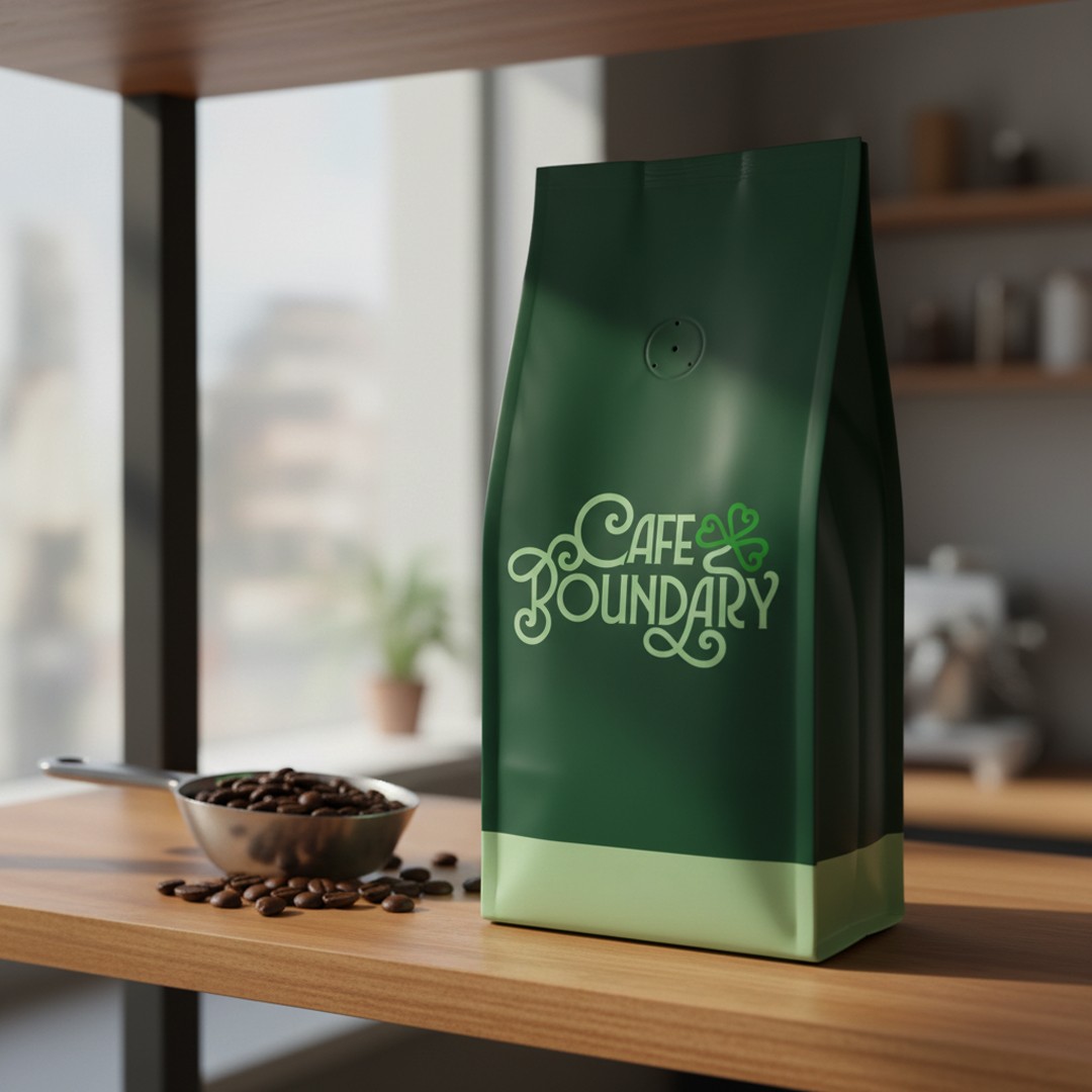
Cafe Boundary was a brief about belonging. The identity needed to make people feel welcome before they even walked in the door. The identity had one job: make people feel welcome before they reach the door. The script lettering fought legibility for a few rounds until the flourishes learned their place. Now the same mark reads at wall-mural scale and on the side of a takeaway cup.
Have a project in mind?
