
THE SPORTS BAR
THE SPORTS BAR
Visual Identity System
Creative Direction
Challenge
Every bar in the city hangs a screen and calls itself a sports bar. This one needed a mark that picks a side, built for people who plan their week around the game.
outcome
A complete identity system built around a bottle cap emblem. It carries game-night energy and still holds up on a coaster, a venue wall, and a social avatar.
Client
The Sports Bar
Industry
F&B / Entertainment
Year
2025
project brief
The Sports Bar is a sports-focused bar built for true sports enthusiasts, the brand needed an identity that could communicate unrelenting passion for the game, camaraderie, and celebration, without looking like every other bar in the city. The brief was a full identity system from scratch, including logo variations, a color system, usage guidelines, and a complete brand guide delivered for both print and digital applications.
What the icon stands for
What our iconstands for
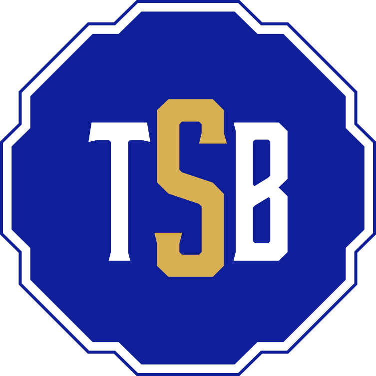
The mark takes its shape from a bottle cap, a form that doubles as a powerful emblem of camaraderie and celebration. Inside, the full name lockup uses gritty, masculine typography full of movement, mirroring the adrenaline energy of the biggest games. The initials version, TSB, gives the brand a compact mark for contexts where the full emblem is too detailed. Together they create a system that reads as raw and authentic without losing the structural integrity needed to work at any scale.
The mark combines three overlapping ellipses, each colour representing one of STS's three age groups, nursery through to year two. The shape is built on the letterform S and draws from the visual metaphor of stacked stepping stones, which is where the school gets its name.
The mark takes its shape from a bottle cap, a form that doubles as a powerful emblem of camaraderie and celebration. Inside, the full name lockup uses gritty, masculine typography full of movement, mirroring the adrenaline energy of the biggest games. The initials version, TSB, gives the brand a compact mark for contexts where the full emblem is too detailed. Together they create a system that reads as raw and authentic without losing the structural integrity needed to work at any scale.

Bottle Cap Shape
+

Brand Initials
=
Bottle Cap Shape
+
Brand Initials
=
Bottle Cap Shape
+
Brand Initials
Scalable Identity System
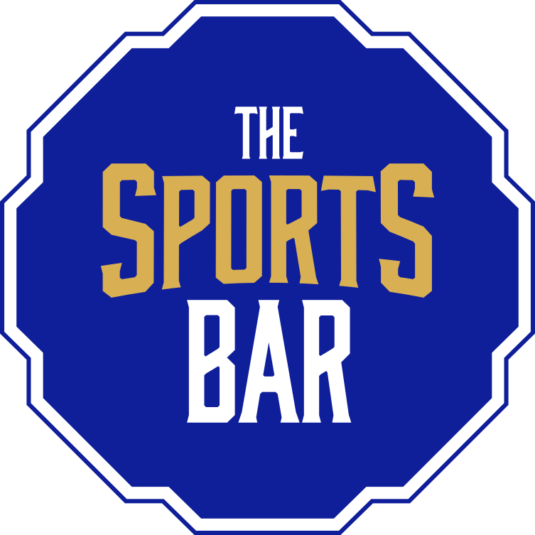
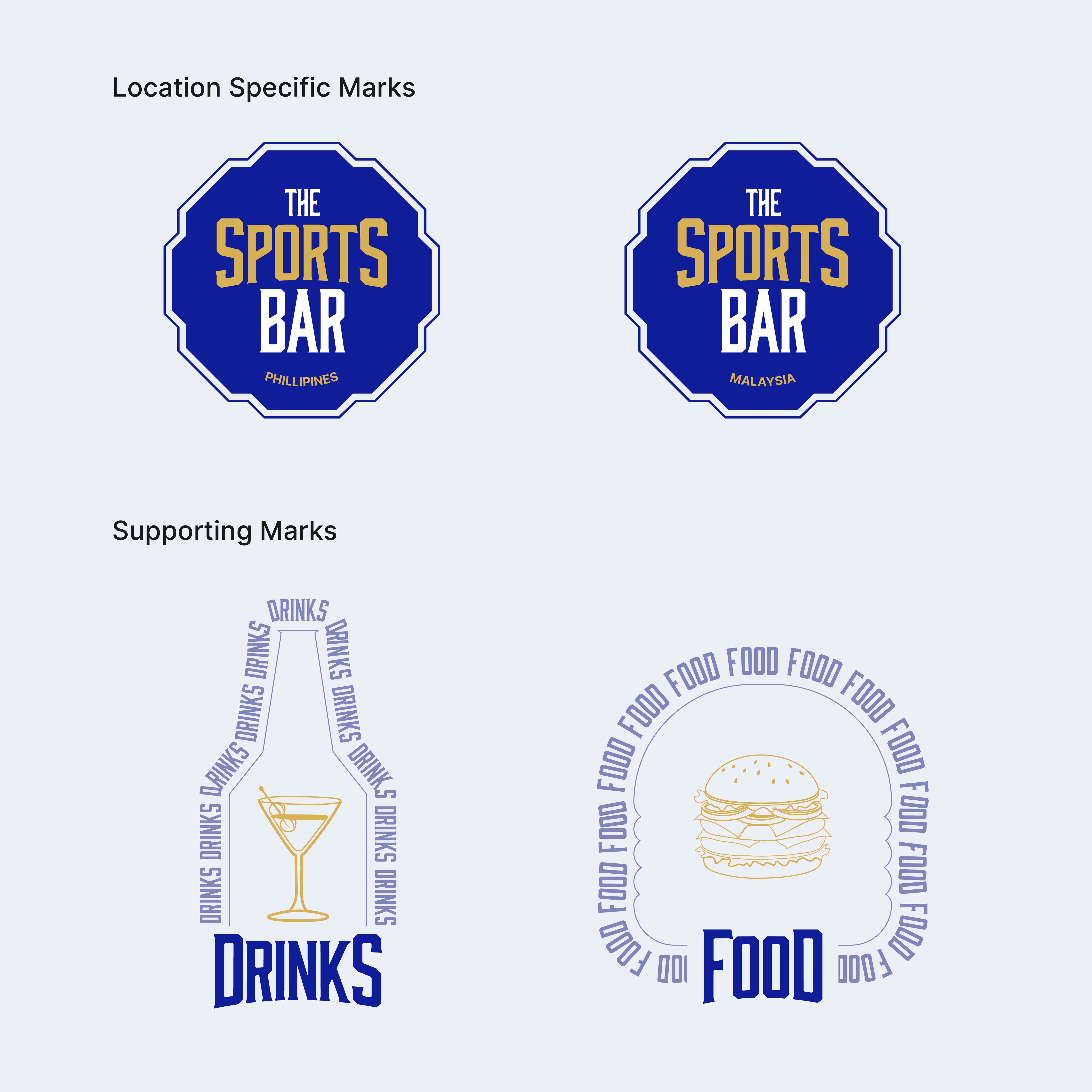
The Sports Bar identity was built with four lockups: the primary emblem, stacked type, initial badge, and wordmark. Each serves a specific context, from a large venue sign to a drinks coaster to a social media avatar. The system was designed so the brand never has to compromise on legibility or impact regardless of where it appears. Location-specific marks for Hotel Boundary and Junction Square allow each venue to carry its own identity within the same system.
Logo Variations
Primary Lockup

Initial Badge
Secondary Lockup
Word Mark
color palette
#823439
#823439
#823439
#823439
#823439
#823439
Tint & Shade
20% lightness increments
Typography
The typeface carries as much personality as the mark itself. Gritty, condensed, and full of movement, the letterforms mirror the physicality of sports without tipping into parody. The hierarchy between "THE," "SPORTS," and "BAR" in the primary lockup is deliberate: SPORTS carries the most visual weight, because that is what this place is about.
primary type face
Cooper Hewitt
Hierarchy & Weight
Aa
Thin
Aa
Regular
Aa
Semi-Bold
Aa
Heavy

Primary Lockup

Secondary Lockup

Initial Badge

Word Mark
Scalable Identity System
The Sports Bar identity was built with four lockups: the primary emblem, stacked type, initial badge, and wordmark. Each serves a specific context, from a large venue sign to a drinks coaster to a social media avatar. The system was designed so the brand never has to compromise on legibility or impact regardless of where it appears. Location-specific marks for Hotel Boundary and Junction Square allow each venue to carry its own identity within the same system.
Logo Variations
Primary Lockup
Icon-only
Vertical Lockup
Word Mark
color palette
#823439
#823439
#823439
#823439
#823439
#823439
Tint & Shade
20% lightness increments
Typography
The typeface carries as much personality as the mark itself. Gritty, condensed, and full of movement, the letterforms mirror the physicality of sports without tipping into parody. The hierarchy between "THE," "SPORTS," and "BAR" in the primary lockup is deliberate: SPORTS carries the most visual weight, because that is what this place is about.
primary type face
Cooper Hewitt
Hierarchy & Weight
Aa
Thin
Aa
Regular
Aa
Semi-Bold
Aa
Heavy
Scalable Identity System
The Sports Bar identity was built with four lockups: the primary emblem, stacked type, initial badge, and wordmark. Each serves a specific context, from a large venue sign to a drinks coaster to a social media avatar. The system was designed so the brand never has to compromise on legibility or impact regardless of where it appears. Location-specific marks for Hotel Boundary and Junction Square allow each venue to carry its own identity within the same system.
Logo Variations
Primary Lockup
Icon-only
Vertical Lockup
Word Mark
color palette
#823439
#823439
#823439
#823439
#823439
#823439
Tint & Shade
20% lightness increments
Typography
The typeface carries as much personality as the mark itself. Gritty, condensed, and full of movement, the letterforms mirror the physicality of sports without tipping into parody. The hierarchy between "THE," "SPORTS," and "BAR" in the primary lockup is deliberate: SPORTS carries the most visual weight, because that is what this place is about.
primary type face
Cooper Hewitt
Hierarchy & Weight
Aa
Thin
Aa
Regular
Aa
Semi-Bold
Aa
Heavy
Scalable Identity System
The Sports Bar identity was built with four lockups: the primary emblem, stacked type, initial badge, and wordmark. Each serves a specific context, from a large venue sign to a drinks coaster to a social media avatar. The system was designed so the brand never has to compromise on legibility or impact regardless of where it appears. Location-specific marks for Hotel Boundary and Junction Square allow each venue to carry its own identity within the same system.
Logo Variations
Primary Lockup
Icon-only
Vertical Lockup
Word Mark
color palette
#823439
#823439
#823439
#823439
#823439
#823439
Tint & Shade
20% lightness increments
Typography
The typeface carries as much personality as the mark itself. Gritty, condensed, and full of movement, the letterforms mirror the physicality of sports without tipping into parody. The hierarchy between "THE," "SPORTS," and "BAR" in the primary lockup is deliberate: SPORTS carries the most visual weight, because that is what this place is about.
primary type face
Cooper Hewitt
Hierarchy & Weight
Aa
Thin
Aa
Regular
Aa
Semi-Bold
Aa
Heavy

Scalable Identity System
The Sports Bar identity was built with four lockups: the primary emblem, stacked type, initial badge, and wordmark. Each serves a specific context, from a large venue sign to a drinks coaster to a social media avatar. The system was designed so the brand never has to compromise on legibility or impact regardless of where it appears. Location-specific marks for Hotel Boundary and Junction Square allow each venue to carry its own identity within the same system.
Logo Variations
Primary Lockup
Icon-only
Vertical Lockup
Word Mark
Color
The palette is built for intensity. Royal Blue anchors the brand with authority and depth, drawing on the visual language of sports jerseys and stadium culture. Brass Gold brings energy and class, the color of trophies, winning, and celebration. Together they create a combination that feels earned rather than chosen, the right colors for a bar that takes sports seriously.
color palette
Tints & Shades
20% lightness increments
Typography
The typeface carries as much personality as the mark itself. Gritty, condensed, and full of movement, the letterforms mirror the physicality of sports without tipping into parody. The hierarchy between "THE," "SPORTS," and "BAR" in the primary lockup is deliberate: SPORTS carries the most visual weight, because that is what this place is about.
primary type face
Cooper Hewitt
Hierarchy & Weight
Aa
Thin
Aa
Regular
Aa
Semi-Bold
Aa
Heavy
Scalable Identity System
The Sports Bar identity was built with four lockups: the primary emblem, stacked type, initial badge, and wordmark. Each serves a specific context, from a large venue sign to a drinks coaster to a social media avatar. The system was designed so the brand never has to compromise on legibility or impact regardless of where it appears. Location-specific marks for Hotel Boundary and Junction Square allow each venue to carry its own identity within the same system.
Logo Variations
Primary Lockup
Icon-only
Vertical Lockup
Word Mark
Color
The palette is built for intensity. Royal Blue anchors the brand with authority and depth, drawing on the visual language of sports jerseys and stadium culture. Brass Gold brings energy and class, the color of trophies, winning, and celebration. Together they create a combination that feels earned rather than chosen, the right colors for a bar that takes sports seriously.
color palette
#162999
#D8AF52
#08143F
Tints & Shades
20% lightness increments
Typography
The typeface carries as much personality as the mark itself. Gritty, condensed, and full of movement, the letterforms mirror the physicality of sports without tipping into parody. The hierarchy between "THE," "SPORTS," and "BAR" in the primary lockup is deliberate: SPORTS carries the most visual weight, because that is what this place is about.
primary type face
Cooper Hewitt
Hierarchy & Weight
Aa
Thin
Aa
Regular
Aa
Semi-Bold
Aa
Heavy
Scalable Identity System
The Sports Bar identity was built with four lockups: the primary emblem, stacked type, initial badge, and wordmark. Each serves a specific context, from a large venue sign to a drinks coaster to a social media avatar. The system was designed so the brand never has to compromise on legibility or impact regardless of where it appears. Location-specific marks for Hotel Boundary and Junction Square allow each venue to carry its own identity within the same system.
Logo Variations
Primary Lockup
Icon-only
Vertical Lockup
Word Mark
Color
The palette is built for intensity. Royal Blue anchors the brand with authority and depth, drawing on the visual language of sports jerseys and stadium culture. Brass Gold brings energy and class, the color of trophies, winning, and celebration. Together they create a combination that feels earned rather than chosen, the right colors for a bar that takes sports seriously.
color palette
#823439
#823439
#823439
Tints & Shades
20% lightness increments
Typography
The typeface carries as much personality as the mark itself. Gritty, condensed, and full of movement, the letterforms mirror the physicality of sports without tipping into parody. The hierarchy between "THE," "SPORTS," and "BAR" in the primary lockup is deliberate: SPORTS carries the most visual weight, because that is what this place is about.
primary type face
Cooper Hewitt
Hierarchy & Weight
Aa
Thin
Aa
Regular
Aa
Semi-Bold
Aa
Heavy

Typographic Variations
Color
The palette is built for intensity. Royal Blue anchors the brand with authority and depth, drawing on the visual language of sports jerseys and stadium culture. Brass Gold brings energy and class, the color of trophies, winning, and celebration. Together they create a combination that feels earned rather than chosen, the right colors for a bar that takes sports seriously.
Logo Variations
Primary Lockup
Icon-only
Vertical Lockup
Word Mark
Color
The palette is built for intensity. Royal Blue anchors the brand with authority and depth, drawing on the visual language of sports jerseys and stadium culture. Brass Gold brings energy and class, the color of trophies, winning, and celebration. Together they create a combination that feels earned rather than chosen, the right colors for a bar that takes sports seriously.
color palette
#823439
#823439
#823439
#823439
#823439
#823439
Tint & Shade
20% lightness increments
Typography
The typeface carries as much personality as the mark itself. Gritty, condensed, and full of movement, the letterforms mirror the physicality of sports without tipping into parody. The hierarchy between "THE," "SPORTS," and "BAR" in the primary lockup is deliberate: SPORTS carries the most visual weight, because that is what this place is about.
primary type face
Hierarchy & Weight
Color
The palette is built for intensity. Royal Blue anchors the brand with authority and depth, drawing on the visual language of sports jerseys and stadium culture. Brass Gold brings energy and class, the color of trophies, winning, and celebration. Together they create a combination that feels earned rather than chosen, the right colors for a bar that takes sports seriously.
Logo Variations
Primary Lockup
Icon-only
Vertical Lockup
Word Mark
Color
The palette is built for intensity. Royal Blue anchors the brand with authority and depth, drawing on the visual language of sports jerseys and stadium culture. Brass Gold brings energy and class, the color of trophies, winning, and celebration. Together they create a combination that feels earned rather than chosen, the right colors for a bar that takes sports seriously.
color palette
#823439
#823439
#823439
#823439
#823439
#823439
Tint & Shade
20% lightness increments
Typography
The typeface carries as much personality as the mark itself. Gritty, condensed, and full of movement, the letterforms mirror the physicality of sports without tipping into parody. The hierarchy between "THE," "SPORTS," and "BAR" in the primary lockup is deliberate: SPORTS carries the most visual weight, because that is what this place is about.
primary type face
Bourbon
Hierarchy & Weight
Aa
Regular
Aa
Lines
Aa
Textured
Color
The palette is built for intensity. Royal Blue anchors the brand with authority and depth, drawing on the visual language of sports jerseys and stadium culture. Brass Gold brings energy and class, the color of trophies, winning, and celebration. Together they create a combination that feels earned rather than chosen, the right colors for a bar that takes sports seriously.
Logo Variations
Primary Lockup
Icon-only
Vertical Lockup
Word Mark
Color
The palette is built for intensity. Royal Blue anchors the brand with authority and depth, drawing on the visual language of sports jerseys and stadium culture. Brass Gold brings energy and class, the color of trophies, winning, and celebration. Together they create a combination that feels earned rather than chosen, the right colors for a bar that takes sports seriously.
color palette
#823439
#823439
#823439
#823439
#823439
#823439
Tint & Shade
20% lightness increments
Typography
The typeface carries as much personality as the mark itself. Gritty, condensed, and full of movement, the letterforms mirror the physicality of sports without tipping into parody. The hierarchy between "THE," "SPORTS," and "BAR" in the primary lockup is deliberate: SPORTS carries the most visual weight, because that is what this place is about.
primary type face
Bourbon
Hierarchy & Weight
Aa
Regular
Aa
Lines
Aa
Textured
How I Built It
How I Built It
GRITTY
VIBRANT
PROUD
COMPETITIVE
CLASSIC
BOLD
AUTHENTIC
ENERGETIC
RUGGED
CELEBRATORY
RAW
SPORTY
COMMANDING
POWERFUL
LOYAL
MASCULINE
UNAPOLOGETIC
INTENSE
DYNAMIC
SOCIAL
COMMUNAL
PASSIONATE
GRITTY
VIBRANT
PROUD
COMPETITIVE
CLASSIC
BOLD
AUTHENTIC
ENERGETIC
RUGGED
CELEBRATORY
RAW
SPORTY
COMMANDING
POWERFUL
LOYAL
MASCULINE
UNAPOLOGETIC
INTENSE
DYNAMIC
SOCIAL
COMMUNAL
PASSIONATE
GRITTY
VIBRANT
PROUD
COMPETITIVE
CLASSIC
BOLD
AUTHENTIC
ENERGETIC
RUGGED
CELEBRATORY
RAW
SPORTY
COMMANDING
POWERFUL
LOYAL
MASCULINE
UNAPOLOGETIC
INTENSE
DYNAMIC
SOCIAL
COMMUNAL
PASSIONATE
Mindmapping
Before any mark was drawn, the process started with a mind map to unpack everything the brand needed to communicate. Bold, gritty, communal, loud. That thinking shaped the direction before a single line hit paper.
Before any mark was drawn, the process started with a mind map to unpack everything the brand needed to communicate. Playfulness, safety, growth, accessibility. That thinking shaped the direction before a single line hit paper.
How i built it
Shields, jersey marks, and abstract sport symbols came first. None of them said bar. The bottle cap said both at once: a sports emblem and a drinking emblem in one shape, with enough depth to build a full system on.
GRITTY
VIBRANT
PROUD
COMPETITIVE
CLASSIC
BOLD
AUTHENTIC
ENERGETIC
RUGGED
CELEBRATORY
RAW
SPORTY
COMMANDING
POWERFUL
LOYAL
MASCULINE
UNAPOLOGETIC
INTENSE
DYNAMIC
SOCIAL
COMMUNAL
PASSIONATE
Mindmapping
Before any mark was drawn, the process started with a mind map to unpack everything the brand needed to communicate. Playfulness, safety, growth, accessibility. That thinking shaped the direction before a single line hit paper.
How i built it
Shields, jersey marks, and abstract sport symbols came first. None of them said bar. The bottle cap said both at once: a sports emblem and a drinking emblem in one shape, with enough depth to build a full system on.
logo in use
logo in use


final thoughts
The Sports Bar was a brief about energy. The identity needed to walk into a room and be felt before it was read. The bottle cap mark does that. It is bold enough to hold its own on a venue wall, compact enough to work on a drinks coaster, and distinctive enough that it does not look like anything else in the market. The typography was the real fight. Grit is easy. Legible grit took the longest.
Have a project in mind?
