
Stepping Stones
Stepping Stones
Visual Identity System
Creative Direction
Challenge
A new preschool with a clear philosophy but no visual identity to match it. The brand needed to feel playful and welcoming without looking generic or childish.
outcome
A full identity system built around the concept of stepping stones and three age groups, scalable from business cards to billboards and adopted across all brand touchpoints.
Client
STS Company Limited
Industry
Education
Year
2023
CREDITS
characters: SANDY
project brief
STS Learning Hub is a preschool built around activity-based, child-centered learning. A new brand with a clear philosophy but no visual identity to match it. The brief was to build a full identity system from scratch, one that felt playful and welcoming without looking like every other preschool, and scalable enough to work consistently across digital, print, and physical touchpoints.
Tagline: Nurturing Curiosity, Inspiring Confidence.
What the icon stands for
What our iconstands for
The mark combines three overlapping ellipses, each colour representing one of STS's three age groups, nursery through to year two. The shape is built on the letterform S and draws from the visual metaphor of stacked stepping stones, which is where the school gets its name.
The mark combines three overlapping ellipses, each colour representing one of STS's three age groups, nursery through to year two. The shape is built on the letterform S and draws from the visual metaphor of stacked stepping stones, which is where the school gets its name.
The mark combines three overlapping ellipses, each colour representing one of STS's three age groups, nursery through to year two. The shape is built on the letterform S and draws from the visual metaphor of stacked stepping stones, which is where the school gets its name.

A stack of three stones
+

Letter “S”
+

3 Age Groups of Students
=

A stack of three stones
+
Letter “S”
+
3 Age Groups of Students
=
A stack of three stones
+
Letter “S”
+
3 Age Groups of Students
Scalable Identity System
A logo needs to work everywhere, from a billboard to a favicon. The STS identity was built with that range in mind from the start, with four distinct lockup variations that each serve a specific context without compromising the brand.
Rather than forcing one version into every situation, the system gives STS the right tool for the right space. Each variation allows the brand to stay consistent regardless of where it appears.
Logo Variations
Primary Lockup
Icon-Only Lockup
Verrtical Lockup

Word Mark

color palette
#823439
#823439
#823439
#823439
#823439
#823439
Tint & Shade
20% lightness increments
Typography
Cooper Hewitt is a geometric sans-serif with just enough warmth to feel approachable. Clean and modern, but never cold. It was the right fit for a brand that needed to speak to parents with confidence while still feeling welcoming to a three year old.
primary type face
Cooper Hewitt
Hierarchy & Weight
Aa
Thin
Aa
Regular
Aa
Semi-Bold
Aa
Heavy

Primary Lockup

Verrtical Lockup
Icon-Only Lockup

Word Mark
Scalable Identity System
A logo needs to work everywhere, from a billboard to a favicon. The STS identity was built with that range in mind from the start, with four distinct lockup variations that each serve a specific context without compromising the brand.
Rather than forcing one version into every situation, the system gives STS the right tool for the right space. Each variation allows the brand to stay consistent regardless of where it appears.
Logo Variations
Primary Lockup
Icon-only
Vertical Lockup
Word Mark
color palette
#823439
#823439
#823439
#823439
#823439
#823439
Tint & Shade
20% lightness increments
Typography
Cooper Hewitt is a geometric sans-serif with just enough warmth to feel approachable. Clean and modern, but never cold. It was the right fit for a brand that needed to speak to parents with confidence while still feeling welcoming to a three year old.
primary type face
Cooper Hewitt
Hierarchy & Weight
Aa
Thin
Aa
Regular
Aa
Semi-Bold
Aa
Heavy
Scalable Identity System
A logo needs to work everywhere, from a billboard to a favicon. The STS identity was built with that range in mind from the start, with four distinct lockup variations that each serve a specific context without compromising the brand.
Rather than forcing one version into every situation, the system gives STS the right tool for the right space. Each variation allows the brand to stay consistent regardless of where it appears.
Logo Variations
Primary Lockup
Icon-only
Vertical Lockup
Word Mark
color palette
#823439
#823439
#823439
#823439
#823439
#823439
Tint & Shade
20% lightness increments
Typography
Cooper Hewitt is a geometric sans-serif with just enough warmth to feel approachable. Clean and modern, but never cold. It was the right fit for a brand that needed to speak to parents with confidence while still feeling welcoming to a three year old.
primary type face
Cooper Hewitt
Hierarchy & Weight
Aa
Thin
Aa
Regular
Aa
Semi-Bold
Aa
Heavy
Scalable Identity System
A logo needs to work everywhere, from a billboard to a favicon. The STS identity was built with that range in mind from the start, with four distinct lockup variations that each serve a specific context without compromising the brand.
Rather than forcing one version into every situation, the system gives STS the right tool for the right space. Each variation allows the brand to stay consistent regardless of where it appears.
Logo Variations
Primary Lockup
Icon-only
Vertical Lockup
Word Mark
color palette
#823439
#823439
#823439
#823439
#823439
#823439
Tint & Shade
20% lightness increments
Typography
Cooper Hewitt is a geometric sans-serif with just enough warmth to feel approachable. Clean and modern, but never cold. It was the right fit for a brand that needed to speak to parents with confidence while still feeling welcoming to a three year old.
primary type face
Cooper Hewitt
Hierarchy & Weight
Aa
Thin
Aa
Regular
Aa
Semi-Bold
Aa
Heavy


Scalable Identity System
A logo needs to work everywhere, from a billboard to a favicon. The STS identity was built with that range in mind from the start, with four distinct lockup variations that each serve a specific context without compromising the brand.
Rather than forcing one version into every situation, the system gives STS the right tool for the right space. Each variation allows the brand to stay consistent regardless of where it appears.
Logo Variations
Primary Lockup
Icon-only
Vertical Lockup
Word Mark
Color
The palette was chosen to reflect the world children interact with naturally. Sea Blue for open skies and water, Nature Green for grass and growth, Sunny Yellow for warmth and energy. Each colour carries meaning but together they stay balanced, vibrant without being chaotic, friendly without being infantile.
color palette
Tints & Shades
20% lightness increments
Typography
Cooper Hewitt is a geometric sans-serif with just enough warmth to feel approachable. Clean and modern, but never cold. It was the right fit for a brand that needed to speak to parents with confidence while still feeling welcoming to a three year old.
primary type face
Cooper Hewitt
Hierarchy & Weight
Aa
Thin
Aa
Regular
Aa
Semi-Bold
Aa
Heavy
Scalable Identity System
A logo needs to work everywhere, from a billboard to a favicon. The STS identity was built with that range in mind from the start, with four distinct lockup variations that each serve a specific context without compromising the brand.
Rather than forcing one version into every situation, the system gives STS the right tool for the right space. Each variation allows the brand to stay consistent regardless of where it appears.
Logo Variations
Primary Lockup
Icon-only
Vertical Lockup
Word Mark
Color
The palette was chosen to reflect the world children interact with naturally. Sea Blue for open skies and water, Nature Green for grass and growth, Sunny Yellow for warmth and energy. Each colour carries meaning but together they stay balanced, vibrant without being chaotic, friendly without being infantile.
color palette
#1EBBE5
#34B24B
#F5D73B
Tints & Shades
20% lightness increments
Typography
Cooper Hewitt is a geometric sans-serif with just enough warmth to feel approachable. Clean and modern, but never cold. It was the right fit for a brand that needed to speak to parents with confidence while still feeling welcoming to a three year old.
primary type face
Cooper Hewitt
Hierarchy & Weight
Aa
Thin
Aa
Regular
Aa
Semi-Bold
Aa
Heavy
Scalable Identity System
A logo needs to work everywhere, from a billboard to a favicon. The STS identity was built with that range in mind from the start, with four distinct lockup variations that each serve a specific context without compromising the brand.
Rather than forcing one version into every situation, the system gives STS the right tool for the right space. Each variation allows the brand to stay consistent regardless of where it appears.
Logo Variations
Primary Lockup
Icon-only
Vertical Lockup
Word Mark
Color
The palette was chosen to reflect the world children interact with naturally. Sea Blue for open skies and water, Nature Green for grass and growth, Sunny Yellow for warmth and energy. Each colour carries meaning but together they stay balanced, vibrant without being chaotic, friendly without being infantile.
color palette
#823439
#823439
#823439
Tints & Shades
20% lightness increments
Typography
Cooper Hewitt is a geometric sans-serif with just enough warmth to feel approachable. Clean and modern, but never cold. It was the right fit for a brand that needed to speak to parents with confidence while still feeling welcoming to a three year old.
primary type face
Cooper Hewitt
Hierarchy & Weight
Aa
Thin
Aa
Regular
Aa
Semi-Bold
Aa
Heavy


Typographic Variations
Color
The palette was chosen to reflect the world children interact with naturally. Sea Blue for open skies and water, Nature Green for grass and growth, Sunny Yellow for warmth and energy. Each colour carries meaning but together they stay balanced, vibrant without being chaotic, friendly without being infantile.
Logo Variations
Primary Lockup
Icon-only
Vertical Lockup
Word Mark
Color
The palette was chosen to reflect the world children interact with naturally. Sea Blue for open skies and water, Nature Green for grass and growth, Sunny Yellow for warmth and energy. Each colour carries meaning but together they stay balanced, vibrant without being chaotic, friendly without being infantile.
color palette
#823439
#823439
#823439
#823439
#823439
#823439
Tint & Shade
20% lightness increments
Typography
Cooper Hewitt is a geometric sans-serif with just enough warmth to feel approachable. Clean and modern, but never cold. It was the right fit for a brand that needed to speak to parents with confidence while still feeling welcoming to a three year old.
primary type face
Hierarchy & Weight
Color
The palette was chosen to reflect the world children interact with naturally. Sea Blue for open skies and water, Nature Green for grass and growth, Sunny Yellow for warmth and energy. Each colour carries meaning but together they stay balanced, vibrant without being chaotic, friendly without being infantile.
Logo Variations
Primary Lockup
Icon-only
Vertical Lockup
Word Mark
Color
The palette was chosen to reflect the world children interact with naturally. Sea Blue for open skies and water, Nature Green for grass and growth, Sunny Yellow for warmth and energy. Each colour carries meaning but together they stay balanced, vibrant without being chaotic, friendly without being infantile.
color palette
#823439
#823439
#823439
#823439
#823439
#823439
Tint & Shade
20% lightness increments
Typography
Cooper Hewitt is a geometric sans-serif with just enough warmth to feel approachable. Clean and modern, but never cold. It was the right fit for a brand that needed to speak to parents with confidence while still feeling welcoming to a three year old.
primary type face
Cooper Hewitt
Hierarchy & Weight
Aa
Thin
Aa
Regular
Aa
Semi-Bold
Aa
Heavy
Color
The palette was chosen to reflect the world children interact with naturally. Sea Blue for open skies and water, Nature Green for grass and growth, Sunny Yellow for warmth and energy. Each colour carries meaning but together they stay balanced, vibrant without being chaotic, friendly without being infantile.
Logo Variations
Primary Lockup
Icon-only
Vertical Lockup
Word Mark
Color
The palette was chosen to reflect the world children interact with naturally. Sea Blue for open skies and water, Nature Green for grass and growth, Sunny Yellow for warmth and energy. Each colour carries meaning but together they stay balanced, vibrant without being chaotic, friendly without being infantile.
color palette
#823439
#823439
#823439
#823439
#823439
#823439
Tint & Shade
20% lightness increments
Typography
Cooper Hewitt is a geometric sans-serif with just enough warmth to feel approachable. Clean and modern, but never cold. It was the right fit for a brand that needed to speak to parents with confidence while still feeling welcoming to a three year old.
primary type face
Cooper Hewitt
Hierarchy & Weight
Aa
Thin
Aa
Regular
Aa
Semi-Bold
Aa
Heavy
How I Built It
How I Built It
Kid-Friendly
Structures
Approachable
Calm
Child-led
Sculpting
Pebbles/ Rocks
Playful
Flowers
Safe
Manners
Scaffolding
Vibrant
Nature-infused
Fun
Structure
Explorative
Symmetry
School-ready
Nurturing
Opportunities
Welcoming
Kid-Friendly
Structures
Approachable
Calm
Child-led
Sculpting
Pebbles/ Rocks
Playful
Flowers
Safe
Manners
Scaffolding
Vibrant
Nature-infused
Fun
Structure
Explorative
Symmetry
School-ready
Nurturing
Opportunities
Welcoming
Kid-Friendly
Structures
Approachable
Calm
Child-led
Sculpting
Pebbles/ Rocks
Playful
Flowers
Safe
Manners
Scaffolding
Vibrant
Nature-infused
Fun
Structure
Explorative
Symmetry
School-ready
Nurturing
Opportunities
Welcoming
Mindmapping
Before any mark was drawn, the process started with a mind map to unpack everything the brand needed to communicate. Playfulness, safety, growth, accessibility. That thinking shaped the direction before a single line hit paper.
Before any mark was drawn, the process started with a mind map to unpack everything the brand needed to communicate. Playfulness, safety, growth, accessibility. That thinking shaped the direction before a single line hit paper.
How i built it
ideation + early sketches
Six concept directions explored before committing to one. Flowers, bridges, open arms, stone symbols, each rooted in the brief but pushing different interpretations of what STS could look like. The stepping stone concept won because it carried the most meaning with the least noise.
Kid-Friendly
Structures
Approachable
Calm
Child-led
Sculpting
Pebbles/ Rocks
Playful
Flowers
Safe
Manners
Scaffolding
Vibrant
Nature-infused
Fun
Structure
Explorative
Symmetry
School-ready
Nurturing
Opportunities
Welcoming
Mindmapping
Before any mark was drawn, the process started with a mind map to unpack everything the brand needed to communicate. Playfulness, safety, growth, accessibility. That thinking shaped the direction before a single line hit paper.
How i built it
ideation + early sketches
Six concept directions explored before committing to one. Flowers, bridges, open arms, stone symbols, each rooted in the brief but pushing different interpretations of what STS could look like. The stepping stone concept won because it carried the most meaning with the least noise.
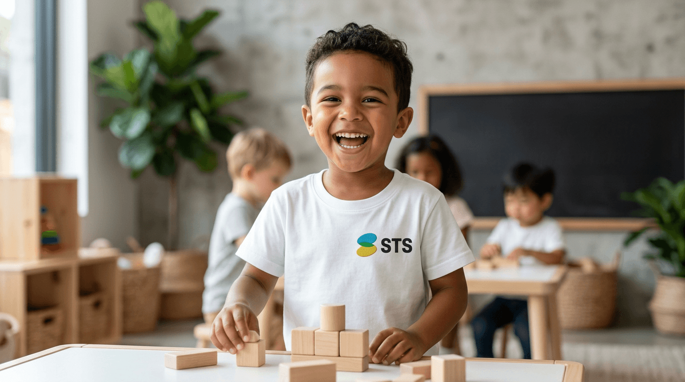
logo in use
logo in use


final thoughts
STS was a brand built from scratch, which meant every decision had to be deliberate. The identity needed to work for a three year old and their parents at the same time, across a bucket hat and a billboard. Getting that balance right took more iterations than expected, but the system that came out of it is one that can grow with the brand for years.
Have a project in mind?
