
Beyond Limits
Beyond Limits
Visual Identity System
Creative Direction
Challenge
A SaaS brand with no visual identity. Nothing to show, nothing to recognise. The risk was ending up with something that looked like every other tech startup: generic blues, forgettable marks, and copy that could belong to anyone.
outcome
A complete brand identity system built around the initials BL, designed to scale from favicon to billboard. Clean, confident, and built to represent a company that takes both its product and its people seriously.
Client
Beyond Limits. Co.
Industry
Technology
Year
2022
project brief
Beyond Limits Technology is a SaaS company, building software solutions for modern businesses. They had a clear product vision but no visual identity to match it. The brief was to create a brand from scratch that felt modern, energetic, and user-friendly. One that could hold its own in the tech space without looking generic.
What the icon stands for
What our iconstands for
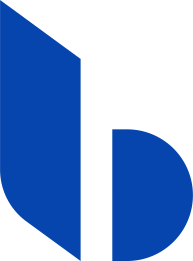
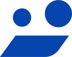
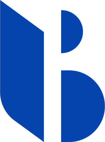
The mark combines two letterforms: the "B" from Beyond and the "L" from Limits. A third element, a human figure in motion, was layered in to reflect the brand's user-first philosophy. Together they read as BL, the company's initials, in a single geometric mark that works as both a tech symbol and a human one.
The mark combines three overlapping ellipses, each colour representing one of STS's three age groups, nursery through to year two. The shape is built on the letterform S and draws from the visual metaphor of stacked stepping stones, which is where the school gets its name.
The mark combines two letterforms: the "B" from Beyond and the "L" from Limits. A third element, a human figure in motion, was layered in to reflect the brand's user-first philosophy. Together they read as BL, the company's initials, in a single geometric mark that works as both a tech symbol and a human one.

Letter “B”
+
Letter “L”
+
User Friendliness
=
Letter “B”
+
Letter “L”
+
User Friendliness
=
Letter “B”
+
Letter “L”
+
User Friendliness
Scalable Identity System
A logo has to work everywhere, from a billboard to a browser tab. The Beyond Limits identity was built with four distinct lockups: vertical, primary, icon-only, and wordmark.
Each designed for a specific context without compromising the brand. The right version for the right space.
Logo Variations
Primary Lockup

Icon-Only Lockup
Verrtical Lockup

Word Mark
color palette
#823439
#823439
#823439
#823439
#823439
#823439
Tint & Shade
20% lightness increments
Typography
Noir is a geometric sans-serif with enough personality to feel modern without tipping into cold. Clean letterforms, consistent weight progression from Light to Bold. The right fit for a tech brand that wants you comfortable and still takes itself seriously.
primary type face
Cooper Hewitt
Hierarchy & Weight
Aa
Thin
Aa
Regular
Aa
Semi-Bold
Aa
Heavy

Primary Lockup

Verrtical Lockup

Icon-Only Lockup

Word Mark
Scalable Identity System
A logo has to work everywhere, from a billboard to a browser tab. The Beyond Limits identity was built with four distinct lockups: vertical, primary, icon-only, and wordmark.
Each designed for a specific context without compromising the brand. The right version for the right space.
Logo Variations
Primary Lockup
Icon-only
Vertical Lockup
Word Mark
color palette
#823439
#823439
#823439
#823439
#823439
#823439
Tint & Shade
20% lightness increments
Typography
Noir is a geometric sans-serif with enough personality to feel modern without tipping into cold. Clean letterforms, consistent weight progression from Light to Bold. The right fit for a tech brand that wants you comfortable and still takes itself seriously.
primary type face
Cooper Hewitt
Hierarchy & Weight
Aa
Thin
Aa
Regular
Aa
Semi-Bold
Aa
Heavy
Scalable Identity System
A logo has to work everywhere, from a billboard to a browser tab. The Beyond Limits identity was built with four distinct lockups: vertical, primary, icon-only, and wordmark.
Each designed for a specific context without compromising the brand. The right version for the right space.
Logo Variations
Primary Lockup
Icon-only
Vertical Lockup
Word Mark
color palette
#823439
#823439
#823439
#823439
#823439
#823439
Tint & Shade
20% lightness increments
Typography
Noir is a geometric sans-serif with enough personality to feel modern without tipping into cold. Clean letterforms, consistent weight progression from Light to Bold. The right fit for a tech brand that wants you comfortable and still takes itself seriously.
primary type face
Cooper Hewitt
Hierarchy & Weight
Aa
Thin
Aa
Regular
Aa
Semi-Bold
Aa
Heavy
Scalable Identity System
A logo has to work everywhere, from a billboard to a browser tab. The Beyond Limits identity was built with four distinct lockups: vertical, primary, icon-only, and wordmark.
Each designed for a specific context without compromising the brand. The right version for the right space.
Logo Variations
Primary Lockup
Icon-only
Vertical Lockup
Word Mark
color palette
#823439
#823439
#823439
#823439
#823439
#823439
Tint & Shade
20% lightness increments
Typography
Noir is a geometric sans-serif with enough personality to feel modern without tipping into cold. Clean letterforms, consistent weight progression from Light to Bold. The right fit for a tech brand that wants you comfortable and still takes itself seriously.
primary type face
Cooper Hewitt
Hierarchy & Weight
Aa
Thin
Aa
Regular
Aa
Semi-Bold
Aa
Heavy
Brand Patterns


Scalable Identity System
A logo has to work everywhere, from a billboard to a browser tab. The Beyond Limits identity was built with four distinct lockups: vertical, primary, icon-only, and wordmark.
Each designed for a specific context without compromising the brand. The right version for the right space.
Logo Variations
Primary Lockup
Icon-only
Vertical Lockup
Word Mark
Color
The palette was built around trust and momentum. Beyond Blue anchors the brand with confidence and authority. Deep Navy adds depth for moments that need weight. Aqua Mint and Crystal Blue bring energy and approachability, stopping the palette from feeling corporate or cold.
color palette
Tints & Shades
20% lightness increments
Typography
Noir is a geometric sans-serif with enough personality to feel modern without tipping into cold. Clean letterforms, consistent weight progression from Light to Bold. The right fit for a tech brand that wants you comfortable and still takes itself seriously.
primary type face
Cooper Hewitt
Hierarchy & Weight
Aa
Thin
Aa
Regular
Aa
Semi-Bold
Aa
Heavy
Scalable Identity System
A logo has to work everywhere, from a billboard to a browser tab. The Beyond Limits identity was built with four distinct lockups: vertical, primary, icon-only, and wordmark.
Each designed for a specific context without compromising the brand. The right version for the right space.
Logo Variations
Primary Lockup
Icon-only
Vertical Lockup
Word Mark
Color
The palette was built around trust and momentum. Beyond Blue anchors the brand with confidence and authority. Deep Navy adds depth for moments that need weight. Aqua Mint and Crystal Blue bring energy and approachability, stopping the palette from feeling corporate or cold.
color palette
#0545AD
#163A6E
#5BDEC6
#83FFFF
Tints & Shades
20% lightness increments
Typography
Noir is a geometric sans-serif with enough personality to feel modern without tipping into cold. Clean letterforms, consistent weight progression from Light to Bold. The right fit for a tech brand that wants you comfortable and still takes itself seriously.
primary type face
Cooper Hewitt
Hierarchy & Weight
Aa
Thin
Aa
Regular
Aa
Semi-Bold
Aa
Heavy
Scalable Identity System
A logo has to work everywhere, from a billboard to a browser tab. The Beyond Limits identity was built with four distinct lockups: vertical, primary, icon-only, and wordmark.
Each designed for a specific context without compromising the brand. The right version for the right space.
Logo Variations
Primary Lockup
Icon-only
Vertical Lockup
Word Mark
Color
The palette was built around trust and momentum. Beyond Blue anchors the brand with confidence and authority. Deep Navy adds depth for moments that need weight. Aqua Mint and Crystal Blue bring energy and approachability, stopping the palette from feeling corporate or cold.
color palette
#823439
#823439
#823439
Tints & Shades
20% lightness increments
Typography
Noir is a geometric sans-serif with enough personality to feel modern without tipping into cold. Clean letterforms, consistent weight progression from Light to Bold. The right fit for a tech brand that wants you comfortable and still takes itself seriously.
primary type face
Cooper Hewitt
Hierarchy & Weight
Aa
Thin
Aa
Regular
Aa
Semi-Bold
Aa
Heavy

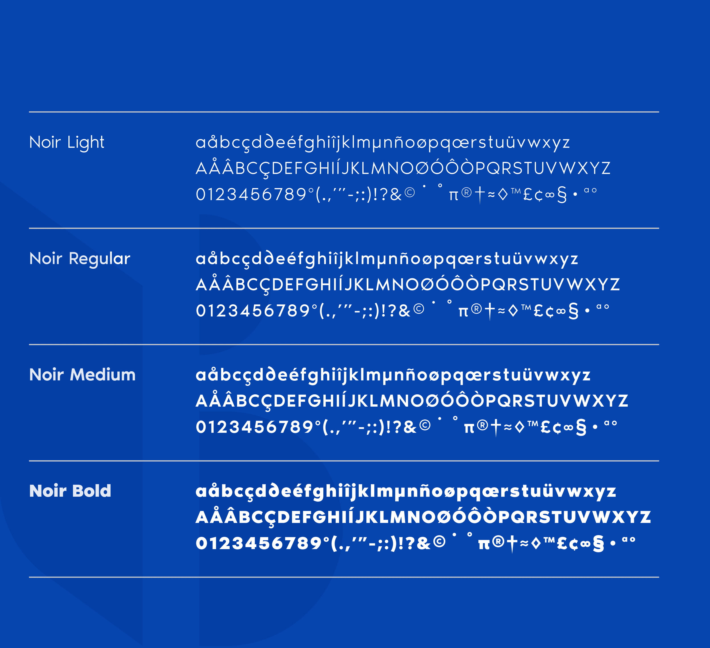
Typographic Variations
Color
The palette was built around trust and momentum. Beyond Blue anchors the brand with confidence and authority. Deep Navy adds depth for moments that need weight. Aqua Mint and Crystal Blue bring energy and approachability, stopping the palette from feeling corporate or cold.
Logo Variations
Primary Lockup
Icon-only
Vertical Lockup
Word Mark
Color
The palette was built around trust and momentum. Beyond Blue anchors the brand with confidence and authority. Deep Navy adds depth for moments that need weight. Aqua Mint and Crystal Blue bring energy and approachability, stopping the palette from feeling corporate or cold.
color palette
#823439
#823439
#823439
#823439
#823439
#823439
Tint & Shade
20% lightness increments
Typography
Noir is a geometric sans-serif with enough personality to feel modern without tipping into cold. Clean letterforms, consistent weight progression from Light to Bold. The right fit for a tech brand that wants you comfortable and still takes itself seriously.
primary type face
Hierarchy & Weight
Color
The palette was built around trust and momentum. Beyond Blue anchors the brand with confidence and authority. Deep Navy adds depth for moments that need weight. Aqua Mint and Crystal Blue bring energy and approachability, stopping the palette from feeling corporate or cold.
Logo Variations
Primary Lockup
Icon-only
Vertical Lockup
Word Mark
Color
The palette was built around trust and momentum. Beyond Blue anchors the brand with confidence and authority. Deep Navy adds depth for moments that need weight. Aqua Mint and Crystal Blue bring energy and approachability, stopping the palette from feeling corporate or cold.
color palette
#823439
#823439
#823439
#823439
#823439
#823439
Tint & Shade
20% lightness increments
Typography
Noir is a geometric sans-serif with enough personality to feel modern without tipping into cold. Clean letterforms, consistent weight progression from Light to Bold. The right fit for a tech brand that wants you comfortable and still takes itself seriously.
primary type face
Noir Pro
Hierarchy & Weight
Aa
Thin
Aa
Regular
Aa
Semi-Bold
Aa
Heavy
Color
The palette was built around trust and momentum. Beyond Blue anchors the brand with confidence and authority. Deep Navy adds depth for moments that need weight. Aqua Mint and Crystal Blue bring energy and approachability, stopping the palette from feeling corporate or cold.
Logo Variations
Primary Lockup
Icon-only
Vertical Lockup
Word Mark
Color
The palette was built around trust and momentum. Beyond Blue anchors the brand with confidence and authority. Deep Navy adds depth for moments that need weight. Aqua Mint and Crystal Blue bring energy and approachability, stopping the palette from feeling corporate or cold.
color palette
#823439
#823439
#823439
#823439
#823439
#823439
Tint & Shade
20% lightness increments
Typography
Noir is a geometric sans-serif with enough personality to feel modern without tipping into cold. Clean letterforms, consistent weight progression from Light to Bold. The right fit for a tech brand that wants you comfortable and still takes itself seriously.
primary type face
Noir Pro
Hierarchy & Weight
Aa
Thin
Aa
Regular
Aa
Semi-Bold
Aa
Heavy
How I Built It
How I Built It
INTUITIVE
FRIENDLY
DYNAMIC
IMPACTFUL
INTEGRATED
SCALABLE
PIONEERING
ADAPTIVE
RELIABLE
INNOVATIVE
B2B
ENERGETIC
CUTTING-EDGE
PRODUCTIVE
TECH-SAVVY
MODERN
PRECISE
USER-CENTRIC
SIMPLE
FLEXIBLE
SEAMLESS
SECURE
INTUITIVE
FRIENDLY
DYNAMIC
IMPACTFUL
INTEGRATED
SCALABLE
PIONEERING
ADAPTIVE
RELIABLE
INNOVATIVE
B2B
ENERGETIC
CUTTING-EDGE
PRODUCTIVE
TECH-SAVVY
MODERN
PRECISE
USER-CENTRIC
SIMPLE
FLEXIBLE
SEAMLESS
SECURE
INTUITIVE
FRIENDLY
DYNAMIC
IMPACTFUL
INTEGRATED
SCALABLE
PIONEERING
ADAPTIVE
RELIABLE
INNOVATIVE
B2B
ENERGETIC
CUTTING-EDGE
PRODUCTIVE
TECH-SAVVY
MODERN
PRECISE
USER-CENTRIC
SIMPLE
FLEXIBLE
SEAMLESS
SECURE
Mindmapping
Before any mark was drawn, the process started with a mind map to unpack everything the brand needed to communicate. Playfulness, safety, growth, accessibility. That thinking shaped the direction before a single line hit paper.
Before any mark was drawn, the process started with a mind map to unpack everything the brand needed to communicate. Playfulness, safety, growth, accessibility. That thinking shaped the direction before a single line hit paper.
How i built it
ideation + early sketches
Morse code, abstract marks, tech shapes, and initials all made it to the table. The BL monogram carried the most meaning with the least noise, so it stayed.
INTUITIVE
FRIENDLY
DYNAMIC
IMPACTFUL
INTEGRATED
SCALABLE
PIONEERING
ADAPTIVE
RELIABLE
INNOVATIVE
B2B
ENERGETIC
CUTTING-EDGE
PRODUCTIVE
TECH-SAVVY
MODERN
PRECISE
USER-CENTRIC
SIMPLE
FLEXIBLE
SEAMLESS
SECURE
Mindmapping
Before any mark was drawn, the process started with a mind map to unpack everything the brand needed to communicate. Playfulness, safety, growth, accessibility. That thinking shaped the direction before a single line hit paper.
How i built it
ideation + early sketches
Morse code, abstract marks, tech shapes, and initials all made it to the table. The BL monogram carried the most meaning with the least noise, so it stayed.
logo in use
logo in use



final thoughts
Beyond Limits came in knowing what they wanted to build. The design work gave that ambition a face. The hard part was making two letters read as a person as well as a product, and the final mark holds both. The system will stretch as the company does.
Have a project in mind?
