
Lead To Tour
Lead To Tour
Visual Identity System
Creative Direction
Challenge
Pilgrims trust this team with the most important journey of their lives. Nothing visual existed to honor that trust, in either English or Arabic.
outcome
A complete dual-language identity built around a crown jewel symbol. Minimal, authoritative, and designed to serve both English and Arabic-speaking audiences with equal clarity.
Client
Lead to Tour Ltd.
Industry
Travel & Tour
Year
February 2024
project brief
Lead to Tour is a Myanmar-based Hajj and Umrah tour service provider with a vision to become the most trusted Islamic pilgrimage agency in the country. They offer all-in-one tour packages for Mecca, Medina, and other Islamic religious destinations, catering to both group and individual pilgrims at accessible midrange pricing. The brief was to build a complete brand identity from scratch that could communicate trust, excellence, and Islamic cultural values, and work consistently across digital and physical touchpoints in both English and Arabic.
What the icon stands for
What our iconstands for
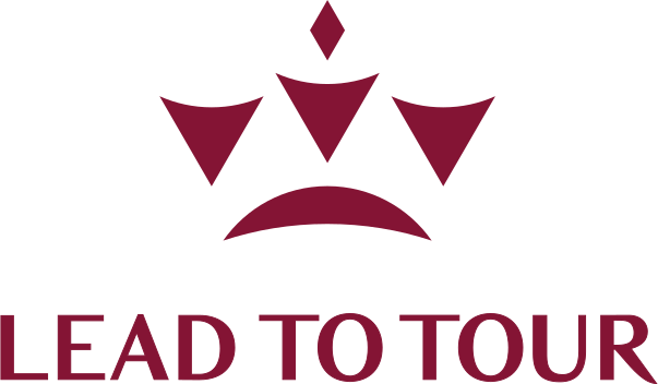
The mark combines three elements: a crescent moon, representing Islamic faith and the spiritual dimension of the journey; a three-pointed crown, representing leadership, excellence, and the aspiration to be the most trusted service provider; and a compass needle, representing guidance, direction, and the act of leading travelers to their destination. Together they form a single mark that reads as a crown jewel symbol, a visual shorthand for trusted, purposeful guidance.
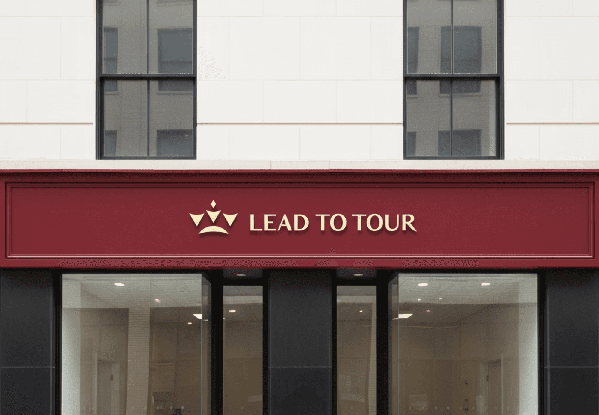
The dual-language lockup, with the wordmark rendered in both English and Arabic script, reflects Lead to Tour's commitment to cultural inclusivity and its dedication to serving a diverse clientele with equal respect and clarity.
The mark combines three overlapping ellipses, each colour representing one of STS's three age groups, nursery through to year two. The shape is built on the letterform S and draws from the visual metaphor of stacked stepping stones, which is where the school gets its name.
The mark combines three elements: a crescent moon, representing Islamic faith and the spiritual dimension of the journey; a three-pointed crown, representing leadership, excellence, and the aspiration to be the most trusted service provider; and a compass needle, representing guidance, direction, and the act of leading travelers to their destination. Together they form a single mark that reads as a crown jewel symbol, a visual shorthand for trusted, purposeful guidance.
The dual-language lockup, with the wordmark rendered in both English and Arabic script, reflects Lead to Tour's commitment to cultural inclusivity and its dedication to serving a diverse clientele with equal respect and clarity.

The Moon
+

A Crown with 3 Points
+

Compass Needle
=

The Moon
+
A Crown with 3 Points
+
Compass Needle
=
The Moon
+
A Crown with 3 Points
+
Compass Needle
Scalable Identity System
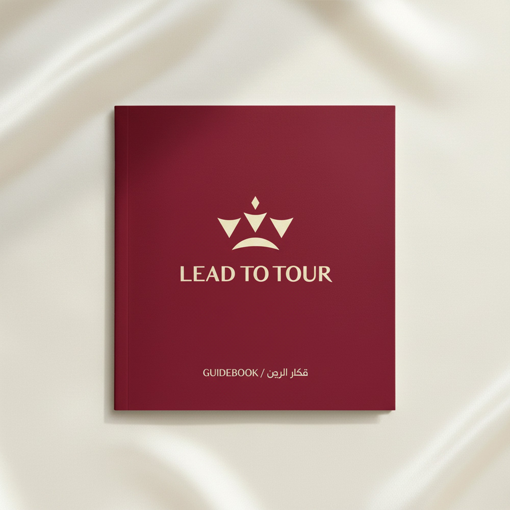
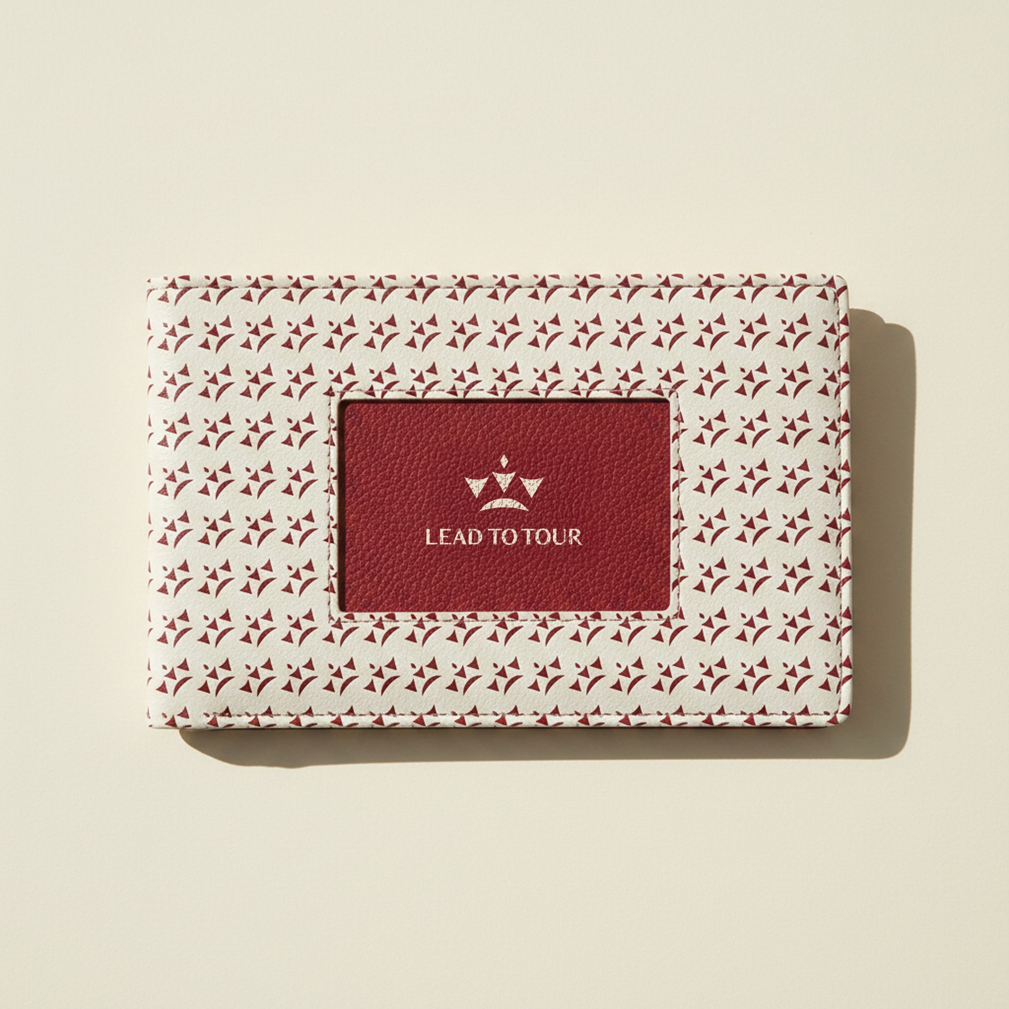
The Lead to Tour identity was built with three lockups: primary, horizontal, and icon-only, plus a badge lockup designed for packaging, seals, and circular applications. Each serves a specific context without compromising the brand's character. The badge lockup carries the secondary tagline "Hajj and Umrah Tour Service" around the icon, giving every touchpoint the full weight of what the brand stands for.
Logo Variations
Primary Lockup
Icon-Only Lockup
Horizontal Lockup

Arabic Lockup

color palette
#823439
#823439
#823439
#823439
#823439
#823439
Tint & Shade
20% lightness increments
Typography
primary type face
Cooper Hewitt
Hierarchy & Weight
Aa
Thin
Aa
Regular
Aa
Semi-Bold
Aa
Heavy
Primary Lockup

Horizontal Lockup

Icon-Only Lockup

Arabic Lockup
Scalable Identity System
The Lead to Tour identity was built with three lockups: primary, horizontal, and icon-only, plus a badge lockup designed for packaging, seals, and circular applications. Each serves a specific context without compromising the brand's character. The badge lockup carries the secondary tagline "Hajj and Umrah Tour Service" around the icon, giving every touchpoint the full weight of what the brand stands for.
Logo Variations
Primary Lockup
Icon-only
Vertical Lockup
Word Mark
color palette
#823439
#823439
#823439
#823439
#823439
#823439
Tint & Shade
20% lightness increments
Typography
primary type face
Cooper Hewitt
Hierarchy & Weight
Aa
Thin
Aa
Regular
Aa
Semi-Bold
Aa
Heavy
Scalable Identity System
The Lead to Tour identity was built with three lockups: primary, horizontal, and icon-only, plus a badge lockup designed for packaging, seals, and circular applications. Each serves a specific context without compromising the brand's character. The badge lockup carries the secondary tagline "Hajj and Umrah Tour Service" around the icon, giving every touchpoint the full weight of what the brand stands for.
Logo Variations
Primary Lockup
Icon-only
Vertical Lockup
Word Mark
color palette
#823439
#823439
#823439
#823439
#823439
#823439
Tint & Shade
20% lightness increments
Typography
primary type face
Cooper Hewitt
Hierarchy & Weight
Aa
Thin
Aa
Regular
Aa
Semi-Bold
Aa
Heavy
Scalable Identity System
The Lead to Tour identity was built with three lockups: primary, horizontal, and icon-only, plus a badge lockup designed for packaging, seals, and circular applications. Each serves a specific context without compromising the brand's character. The badge lockup carries the secondary tagline "Hajj and Umrah Tour Service" around the icon, giving every touchpoint the full weight of what the brand stands for.
Logo Variations
Primary Lockup
Icon-only
Vertical Lockup
Word Mark
color palette
#823439
#823439
#823439
#823439
#823439
#823439
Tint & Shade
20% lightness increments
Typography
primary type face
Cooper Hewitt
Hierarchy & Weight
Aa
Thin
Aa
Regular
Aa
Semi-Bold
Aa
Heavy


Scalable Identity System
The Lead to Tour identity was built with three lockups: primary, horizontal, and icon-only, plus a badge lockup designed for packaging, seals, and circular applications. Each serves a specific context without compromising the brand's character. The badge lockup carries the secondary tagline "Hajj and Umrah Tour Service" around the icon, giving every touchpoint the full weight of what the brand stands for.
Logo Variations
Primary Lockup
Icon-only
Vertical Lockup
Word Mark
Color
The palette was built around trust and nobility. Ruby Red is the primary hue, a deep, authoritative tone that conveys reliability and confidence. It is used as both a background and text color across the identity. Scarlet is the attention hue, a brighter red used with restraint for maximum impact at key moments. Silk is the neutral, a warm yellow-tinted white chosen for backgrounds and subdued typography, giving the palette warmth without losing its seriousness.
color palette
Tints & Shades
20% lightness increments
Typography
primary type face
Cooper Hewitt
Hierarchy & Weight
Aa
Thin
Aa
Regular
Aa
Semi-Bold
Aa
Heavy
Scalable Identity System
The Lead to Tour identity was built with three lockups: primary, horizontal, and icon-only, plus a badge lockup designed for packaging, seals, and circular applications. Each serves a specific context without compromising the brand's character. The badge lockup carries the secondary tagline "Hajj and Umrah Tour Service" around the icon, giving every touchpoint the full weight of what the brand stands for.
Logo Variations
Primary Lockup
Icon-only
Vertical Lockup
Word Mark
Color
The palette was built around trust and nobility. Ruby Red is the primary hue, a deep, authoritative tone that conveys reliability and confidence. It is used as both a background and text color across the identity. Scarlet is the attention hue, a brighter red used with restraint for maximum impact at key moments. Silk is the neutral, a warm yellow-tinted white chosen for backgrounds and subdued typography, giving the palette warmth without losing its seriousness.
color palette
831434
#E7E0CA
#D42652
Tints & Shades
20% lightness increments
Typography
primary type face
Cooper Hewitt
Hierarchy & Weight
Aa
Thin
Aa
Regular
Aa
Semi-Bold
Aa
Heavy
Scalable Identity System
The Lead to Tour identity was built with three lockups: primary, horizontal, and icon-only, plus a badge lockup designed for packaging, seals, and circular applications. Each serves a specific context without compromising the brand's character. The badge lockup carries the secondary tagline "Hajj and Umrah Tour Service" around the icon, giving every touchpoint the full weight of what the brand stands for.
Logo Variations
Primary Lockup
Icon-only
Vertical Lockup
Word Mark
Color
The palette was built around trust and nobility. Ruby Red is the primary hue, a deep, authoritative tone that conveys reliability and confidence. It is used as both a background and text color across the identity. Scarlet is the attention hue, a brighter red used with restraint for maximum impact at key moments. Silk is the neutral, a warm yellow-tinted white chosen for backgrounds and subdued typography, giving the palette warmth without losing its seriousness.
color palette
#823439
#823439
#823439
Tints & Shades
20% lightness increments
Typography
primary type face
Cooper Hewitt
Hierarchy & Weight
Aa
Thin
Aa
Regular
Aa
Semi-Bold
Aa
Heavy


Typographic Variations
Color
The palette was built around trust and nobility. Ruby Red is the primary hue, a deep, authoritative tone that conveys reliability and confidence. It is used as both a background and text color across the identity. Scarlet is the attention hue, a brighter red used with restraint for maximum impact at key moments. Silk is the neutral, a warm yellow-tinted white chosen for backgrounds and subdued typography, giving the palette warmth without losing its seriousness.
Logo Variations
Primary Lockup
Icon-only
Vertical Lockup
Word Mark
Color
The palette was built around trust and nobility. Ruby Red is the primary hue, a deep, authoritative tone that conveys reliability and confidence. It is used as both a background and text color across the identity. Scarlet is the attention hue, a brighter red used with restraint for maximum impact at key moments. Silk is the neutral, a warm yellow-tinted white chosen for backgrounds and subdued typography, giving the palette warmth without losing its seriousness.
color palette
#823439
#823439
#823439
#823439
#823439
#823439
Tint & Shade
20% lightness increments
Typography
primary type face
Hierarchy & Weight
Color
The palette was built around trust and nobility. Ruby Red is the primary hue, a deep, authoritative tone that conveys reliability and confidence. It is used as both a background and text color across the identity. Scarlet is the attention hue, a brighter red used with restraint for maximum impact at key moments. Silk is the neutral, a warm yellow-tinted white chosen for backgrounds and subdued typography, giving the palette warmth without losing its seriousness.
Logo Variations
Primary Lockup
Icon-only
Vertical Lockup
Word Mark
Color
The palette was built around trust and nobility. Ruby Red is the primary hue, a deep, authoritative tone that conveys reliability and confidence. It is used as both a background and text color across the identity. Scarlet is the attention hue, a brighter red used with restraint for maximum impact at key moments. Silk is the neutral, a warm yellow-tinted white chosen for backgrounds and subdued typography, giving the palette warmth without losing its seriousness.
color palette
#823439
#823439
#823439
#823439
#823439
#823439
Tint & Shade
20% lightness increments
Typography
primary type face
BAGNARD
Hierarchy & Weight
Aa
Regular
Color
The palette was built around trust and nobility. Ruby Red is the primary hue, a deep, authoritative tone that conveys reliability and confidence. It is used as both a background and text color across the identity. Scarlet is the attention hue, a brighter red used with restraint for maximum impact at key moments. Silk is the neutral, a warm yellow-tinted white chosen for backgrounds and subdued typography, giving the palette warmth without losing its seriousness.
Logo Variations
Primary Lockup
Icon-only
Vertical Lockup
Word Mark
Color
The palette was built around trust and nobility. Ruby Red is the primary hue, a deep, authoritative tone that conveys reliability and confidence. It is used as both a background and text color across the identity. Scarlet is the attention hue, a brighter red used with restraint for maximum impact at key moments. Silk is the neutral, a warm yellow-tinted white chosen for backgrounds and subdued typography, giving the palette warmth without losing its seriousness.
color palette
#823439
#823439
#823439
#823439
#823439
#823439
Tint & Shade
20% lightness increments
Typography
primary type face
BAGNARD
Hierarchy & Weight
Aa
Regular
How I Built It
How I Built It
EXCELLENCE
CULTURAL
SINCERE
WELCOMING
RESPECTFUL
TRUST
INTEGRITY
HOSPITALITY
TRADITION
HARMONY
AFFORDABILITY
SPIRITUAL
RELIABLE
SACRED
PURPOSEFUL
DIGNIFIED
SERVICE
DEDICATION
DEVOTED
TRANSPARENT
GUIDANCE
LEADERSHIP
EXCELLENCE
CULTURAL
SINCERE
WELCOMING
RESPECTFUL
TRUST
INTEGRITY
HOSPITALITY
TRADITION
HARMONY
AFFORDABILITY
SPIRITUAL
RELIABLE
SACRED
PURPOSEFUL
DIGNIFIED
SERVICE
DEDICATION
DEVOTED
TRANSPARENT
GUIDANCE
LEADERSHIP
EXCELLENCE
CULTURAL
SINCERE
WELCOMING
RESPECTFUL
TRUST
INTEGRITY
HOSPITALITY
TRADITION
HARMONY
AFFORDABILITY
SPIRITUAL
RELIABLE
SACRED
PURPOSEFUL
DIGNIFIED
SERVICE
DEDICATION
DEVOTED
TRANSPARENT
GUIDANCE
LEADERSHIP
Mindmapping
Before any mark was drawn, the process started with a mind map to unpack everything the brand needed to communicate. Trust, guidance, tradition, excellence. That thinking shaped the direction before a single line hit paper.
Before any mark was drawn, the process started with a mind map to unpack everything the brand needed to communicate. Playfulness, safety, growth, accessibility. That thinking shaped the direction before a single line hit paper.
How i built it
Ideation & Sketches
The ideation process was extensive, covering dozens of directions across two sessions of hand sketching and digital exploration. Minarets, compasses, crescent moons, doorways, crowns, lighthouse forms, and geometric Islamic patterns were all explored before converging on the crown jewel concept. The Arabic typography exploration ran in parallel, testing how different script styles balanced with the English wordmark. The crown won because it unified the spiritual, the directional, and the aspirational into a single clean mark that needed no explanation.
EXCELLENCE
CULTURAL
SINCERE
WELCOMING
RESPECTFUL
TRUST
INTEGRITY
HOSPITALITY
TRADITION
HARMONY
AFFORDABILITY
SPIRITUAL
RELIABLE
SACRED
PURPOSEFUL
DIGNIFIED
SERVICE
DEDICATION
DEVOTED
TRANSPARENT
GUIDANCE
LEADERSHIP
Mindmapping
Before any mark was drawn, the process started with a mind map to unpack everything the brand needed to communicate. Playfulness, safety, growth, accessibility. That thinking shaped the direction before a single line hit paper.
How i built it
Ideation & Sketches
The ideation process was extensive, covering dozens of directions across two sessions of hand sketching and digital exploration. Minarets, compasses, crescent moons, doorways, crowns, lighthouse forms, and geometric Islamic patterns were all explored before converging on the crown jewel concept. The Arabic typography exploration ran in parallel, testing how different script styles balanced with the English wordmark. The crown won because it unified the spiritual, the directional, and the aspirational into a single clean mark that needed no explanation.
logo in use
logo in use




final thoughts
Lead to Tour was a brief with real weight. Hajj and Umrah are among the most significant journeys a person can make, and the identity needed to honor that without being heavy-handed about it. It carries authority and faith in one clean shape and never shouts about either. The dual-language lockup was the hardest design problem here, two scripts, one visual weight, neither one an afterthought. That balance is the part of this project I would defend in any room.
Have a project in mind?
