Voyage Bar
Voyage Bar
Voyage Bar

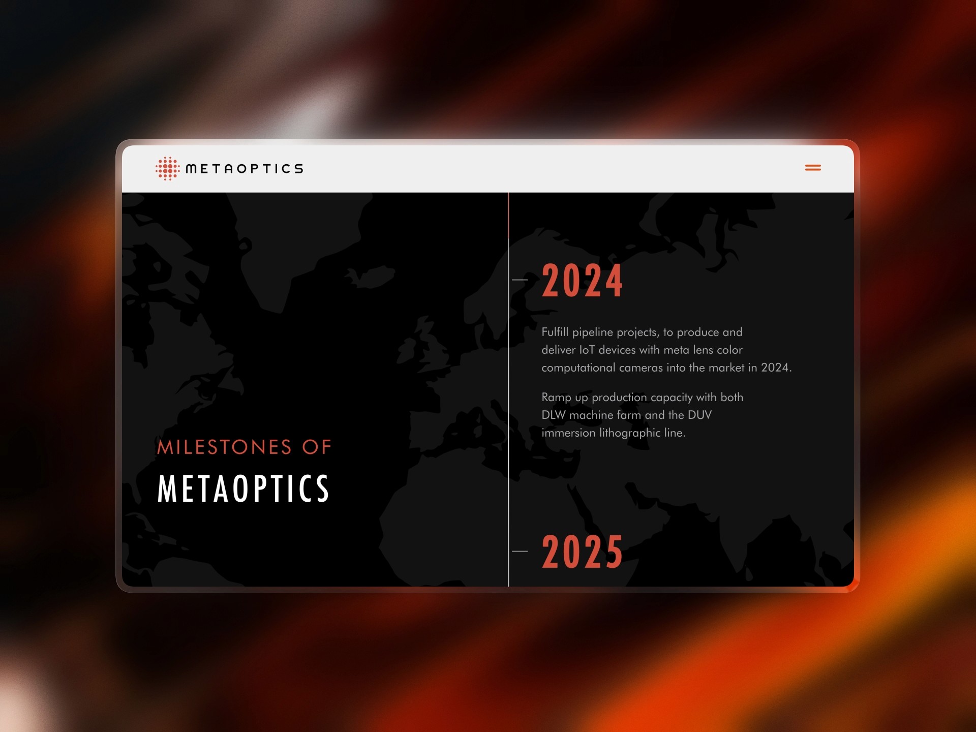
Metaoptics

Metaoptics

Web Design

Creative Direction

Challenge

A Nasdaq-bound deep tech company with a flat product grid, no vertical structure, and no investor relations presence. The site had to match the weight of a public listing before it got there.

outcome

A full site restructure across four business verticals, plus a complete investor relations website built for the US listing. The digital presence finally matched the company behind it.

Client

METAOPTICS TECHNOLOGIES LTD.

Industry

Technology

Year

2026

CREDITS

Tam Do

project brief

MetaOptics is a Singapore-based metalens technology company developing ultra-thin optical components that replace conventional glass lenses in consumer devices, IoT applications, and industrial equipment. Their tagline, "Making Miniaturization Possible," captures a genuine technical breakthrough: metalens technology that collapses multi-element optical systems into a single flat surface. With a Nasdaq listing on the horizon, the brief was twofold: restructure the main product site from a flat, undifferentiated grid into a four-vertical architecture that clearly communicated the business, and build a complete investor relations website from scratch to support the public listing.

What the icon stands for

What our iconstands for

The mark combines three overlapping ellipses, each colour representing one of STS's three age groups, nursery through to year two. The shape is built on the letterform S and draws from the visual metaphor of stacked stepping stones, which is where the school gets its name.

=

=

Scalable Identity System

Logo Variations

color palette

#823439

#823439

#823439

#823439

#823439

#823439

Tint & Shade

20% lightness increments

Typography

primary type face

Cooper Hewitt

Hierarchy & Weight

Aa

Thin

Aa

Regular

Aa

Semi-Bold

Aa

Heavy

What Wasn't Working

The original site had everything on one level. Products, foundry capabilities, development kits, testing equipment, all presented as a flat grid under a single "Our Products" page with no meaningful hierarchy. For a company operating across four genuinely distinct business areas, and one preparing to be scrutinised by institutional investors and analysts, that structure communicated the wrong things: a small company with a single product range, not a technology platform with multiple verticals and a credible path to global scale.

The investor relations problem was more urgent. A Nasdaq listing requires a site that functions as a financial communications platform, with governance pages, board and management team sections, financial filings infrastructure, event calendars, and press release archives. None of that existed. The main site had no investor-facing content at all. With the listing timeline accelerating, the IR website had to be designed, written, and built to compliance standard before the listing date.

There was also a navigation problem specific to the restructure. The new four-vertical architecture introduced a mega-dropdown that let users bypass the vertical landing pages entirely, jumping straight to sub-products without understanding the broader category. That shortcut undermined the whole point of the restructure.

Roles & Responsibility

As a Project Lead, I owned the full pipeline from start to finish.

Creative Direction: Defining the visual language, layout, and overall site experience.

Client Management: Leading briefs, presenting concepts, and aligning on direction throughout.

Team Assembly: Sourcing and onboarding the Webflow developer and animator.

Production Oversight: Briefing the build team and ensuring designs translated correctly into Webflow.

Quality Assurance: Balancing visual ambition against site speed, making sure every interaction held up in the browser.

What Wasn't Working

The original site had everything on one level. Products, foundry capabilities, development kits, testing equipment, all presented as a flat grid under a single "Our Products" page with no meaningful hierarchy. For a company operating across four genuinely distinct business areas, and one preparing to be scrutinised by institutional investors and analysts, that structure communicated the wrong things: a small company with a single product range, not a technology platform with multiple verticals and a credible path to global scale.

The investor relations problem was more urgent. A Nasdaq listing requires a site that functions as a financial communications platform, with governance pages, board and management team sections, financial filings infrastructure, event calendars, and press release archives. None of that existed. The main site had no investor-facing content at all. With the listing timeline accelerating, the IR website had to be designed, written, and built to compliance standard before the listing date.

There was also a navigation problem specific to the restructure. The new four-vertical architecture introduced a mega-dropdown that let users bypass the vertical landing pages entirely, jumping straight to sub-products without understanding the broader category. That shortcut undermined the whole point of the restructure.

How I Fixed It

The restructure organised the site into four top-level verticals: Equipment (lithography, testing, assembly), Foundry (VIS, NIR and SWIR, photonics integration), Products (consumer devices, projection modules, development kits), and a new MetaOptics AI vertical. Each vertical got its own landing page with a consistent overview structure, and the navigation was redesigned so that vertical landing pages were the entry point, not a bypass. The copy was written to be defensible and illustrative across all overview pages, with no hard specifications that could be technically disputed.

The IR website was built in parallel as a self-contained section, covering all the pages a Nasdaq-listed company requires: investor overview, board of directors, management team, governance committees, financial results, SEC filings, press releases, and an FAQ structured around investor questions. Content was coordinated with the client's IR advisors and written to the standards expected of public company communications. B2i dynamic data integration (real-time financial feeds) was wired in and set to activate at listing.

Roles & Responsibility

Creative Direction and Project Lead. Managed the full engagement from restructure strategy to final delivery, coordinating between the client, TDC's development team, and the company's IR advisors.

Creative Direction: Defining the visual language, page hierarchy, and content structure for both the main site restructure and the IR website.
Content Strategy: Writing all website copy across the restructured verticals and the full IR site, calibrated to MetaOptics' institutional tone and public company communications standard.
Information Architecture: Designing the four-vertical site structure and the IR section architecture, including the navigation fix that resolved the landing page bypass problem.
Production Oversight: Briefing and managing the development team across both workstreams, tracking open items with the client, and coordinating the go-live sequence against the listing timeline.

Scalable Identity System

Logo Variations

Primary Lockup

Icon-only

Vertical Lockup

color palette

#823439

#823439

#823439

#823439

#823439

#823439

Tint & Shade

20% lightness increments

Typography

primary type face

Cooper Hewitt

Hierarchy & Weight

Aa

Thin

Aa

Regular

Aa

Semi-Bold

Aa

Heavy

Scalable Identity System

Logo Variations

Primary Lockup

Icon-only

Vertical Lockup

color palette

#823439

#823439

#823439

#823439

#823439

#823439

Tint & Shade

20% lightness increments

Typography

primary type face

Cooper Hewitt

Hierarchy & Weight

Aa

Thin

Aa

Regular

Aa

Semi-Bold

Aa

Heavy

How I Built It

How I Built It

logo in use

logo in use

final thoughts

Have a project in mind?