Voyage Bar
Voyage Bar
Voyage Bar

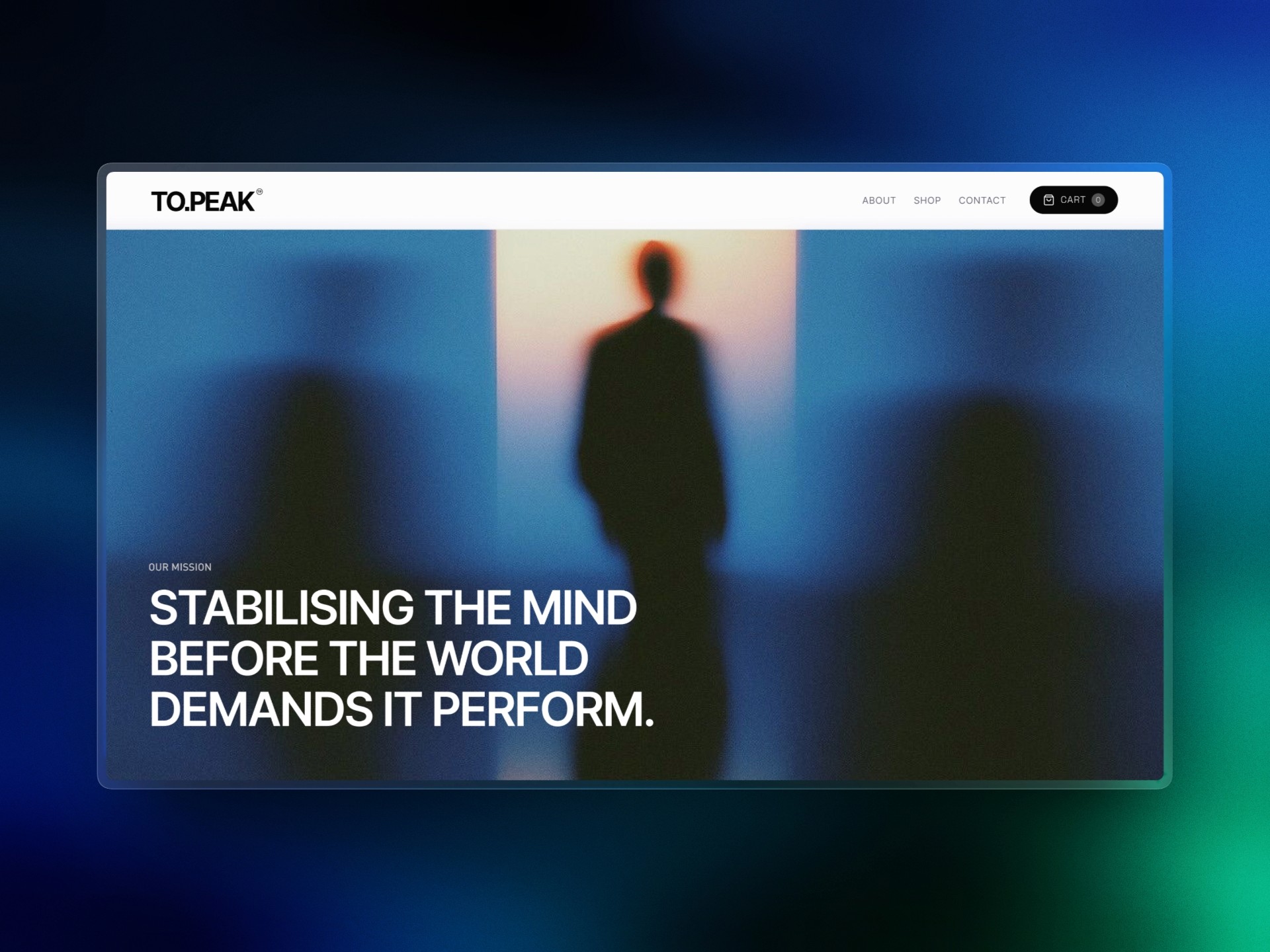
To.Peak

To.Peak

Web Design

Creative Direction

Challenge

A genuinely distinct product concept with no digital presence to match it. The behavioral science positioning needed a site that could sell the idea before it sold the product.

outcome

A Shopify e-commerce build designed around the thought anchoring concept. Product-first hierarchy, bold copy, and a conversion flow that let the positioning do the heavy lifting.

Client

To.Peak

Industry

Health & Wellness

Year

2026

CREDITS

Tam Do

project brief

TO.PEAK is a Singapore-based DTC brand selling flavor-infused birchwood toothpicks engineered as behavioral focus tools. The product line covers three sensory profiles: Zero Mint for sharp alertness, Blueberry for sustained grounding, and White Coffee for clean familiarity, plus an Anchoring Bundle for the full system. The brand is built around the science of thought anchoring, the idea that applying pressure through the jaw engages the trigeminal nerve and grounds a drifting mind. The brief was to design a Shopify e-commerce site that could carry this positioning from landing to checkout, with a brand voice built on bold, declarative copy and a visual language that matched the challenger brand identity.
What the icon stands for

What our iconstands for

The mark combines three overlapping ellipses, each colour representing one of STS's three age groups, nursery through to year two. The shape is built on the letterform S and draws from the visual metaphor of stacked stepping stones, which is where the school gets its name.

=

=

Scalable Identity System

Logo Variations

color palette

#823439

#823439

#823439

#823439

#823439

#823439

Tint & Shade

20% lightness increments

Typography

primary type face

Cooper Hewitt

Hierarchy & Weight

Aa

Thin

Aa

Regular

Aa

Semi-Bold

Aa

Heavy

What Wasn't Working

TO.PEAK launched with a strong brand concept and no site to back it up. The positioning was sophisticated: behavioral science, neurological claims, a deliberate rejection of the caffeine-and-stimulant category. That kind of concept either lands with complete conviction or it reads as pseudoscience. The site needed to thread that needle.

The product itself is a toothpick. The default risk for any DTC brand in this space is that the site ends up looking like a novelty item, which would destroy the premium positioning before a visitor even reached the product page. The visual language, copy hierarchy, and information architecture all had to work together to make a birchwood toothpick read as a tool for the desk, not a novelty for the register.

There was also the conversion problem. DTC e-commerce lives and dies on the product detail page. The thought anchoring science needed to be present and credible at the moment of purchase, not buried in an about page. Getting that balance right across three distinct product SKUs, each with its own sensory profile and use case, required a template structure that could flex without losing consistency.

Roles & Responsibility

As a Project Lead, I owned the full pipeline from start to finish.

Creative Direction: Defining the visual language, layout, and overall site experience.

Client Management: Leading briefs, presenting concepts, and aligning on direction throughout.

Team Assembly: Sourcing and onboarding the Webflow developer and animator.

Production Oversight: Briefing the build team and ensuring designs translated correctly into Webflow.

Quality Assurance: Balancing visual ambition against site speed, making sure every interaction held up in the browser.

What Wasn't Working

TO.PEAK launched with a strong brand concept and no site to back it up. The positioning was sophisticated: behavioral science, neurological claims, a deliberate rejection of the caffeine-and-stimulant category. That kind of concept either lands with complete conviction or it reads as pseudoscience. The site needed to thread that needle.

The product itself is a toothpick. The default risk for any DTC brand in this space is that the site ends up looking like a novelty item, which would destroy the premium positioning before a visitor even reached the product page. The visual language, copy hierarchy, and information architecture all had to work together to make a birchwood toothpick read as a tool for the desk, not a novelty for the register.

There was also the conversion problem. DTC e-commerce lives and dies on the product detail page. The thought anchoring science needed to be present and credible at the moment of purchase, not buried in an about page. Getting that balance right across three distinct product SKUs, each with its own sensory profile and use case, required a template structure that could flex without losing consistency.

How I Fixed It

The architecture was designed around the brand's core argument: focus through control, not stimulation. The homepage leads with the problem (modern attention is broken), positions energy drinks as the symptom and not the solution, and introduces TO.PEAK as the stable intervention. Every section earns the next click.

The product detail page template puts the science inside the purchase moment. The thought anchoring section sits between the buy box and the cross-sell, which means every visitor encounters the neurological rationale before they leave the page. The comparison table does the same job on the homepage, replacing competitor comparison with category comparison: TO.PEAK vs. energy drinks vs. unconscious fidgeting.

Copy and design were developed in parallel for this project. The brand voice is declarative and command-driven, short sentences, no hedging, science stated as fact. Designing to that register meant the layout could be lean and direct, with copy doing most of the persuasion and design providing the authority to back it up.

Roles & Responsibility

As a Project Lead, I owned the full pipeline from start to finish:

Brand Voice: Defining the declarative, command-driven register before any layout work.

Creative Direction: Visual language and page hierarchy built to carry science claims with a straight face.

Client Management: Leading briefs and direction alignment through launch.

Information Architecture: Structuring the site around the buyer's path from curiosity to checkout.

Production Oversight: Briefing the build team and ensuring designs translated correctly into Shopify.

Scalable Identity System

Logo Variations

Primary Lockup

Icon-only

Vertical Lockup

color palette

#823439

#823439

#823439

#823439

#823439

#823439

Tint & Shade

20% lightness increments

Typography

primary type face

Cooper Hewitt

Hierarchy & Weight

Aa

Thin

Aa

Regular

Aa

Semi-Bold

Aa

Heavy

Scalable Identity System

Logo Variations

Primary Lockup

Icon-only

Vertical Lockup

color palette

#823439

#823439

#823439

#823439

#823439

#823439

Tint & Shade

20% lightness increments

Typography

primary type face

Cooper Hewitt

Hierarchy & Weight

Aa

Thin

Aa

Regular

Aa

Semi-Bold

Aa

Heavy

How I Built It

How I Built It

logo in use

logo in use

final thoughts

Have a project in mind?