Voyage Bar
Voyage Bar
Voyage Bar

Dynasty Travel

Dynasty Travel

Web Design

Challenge

A legacy agency that rebranded upmarket but kept the old site. It wasn't communicating the new positioning and trip pages weren't converting browsers into bookers.

outcome

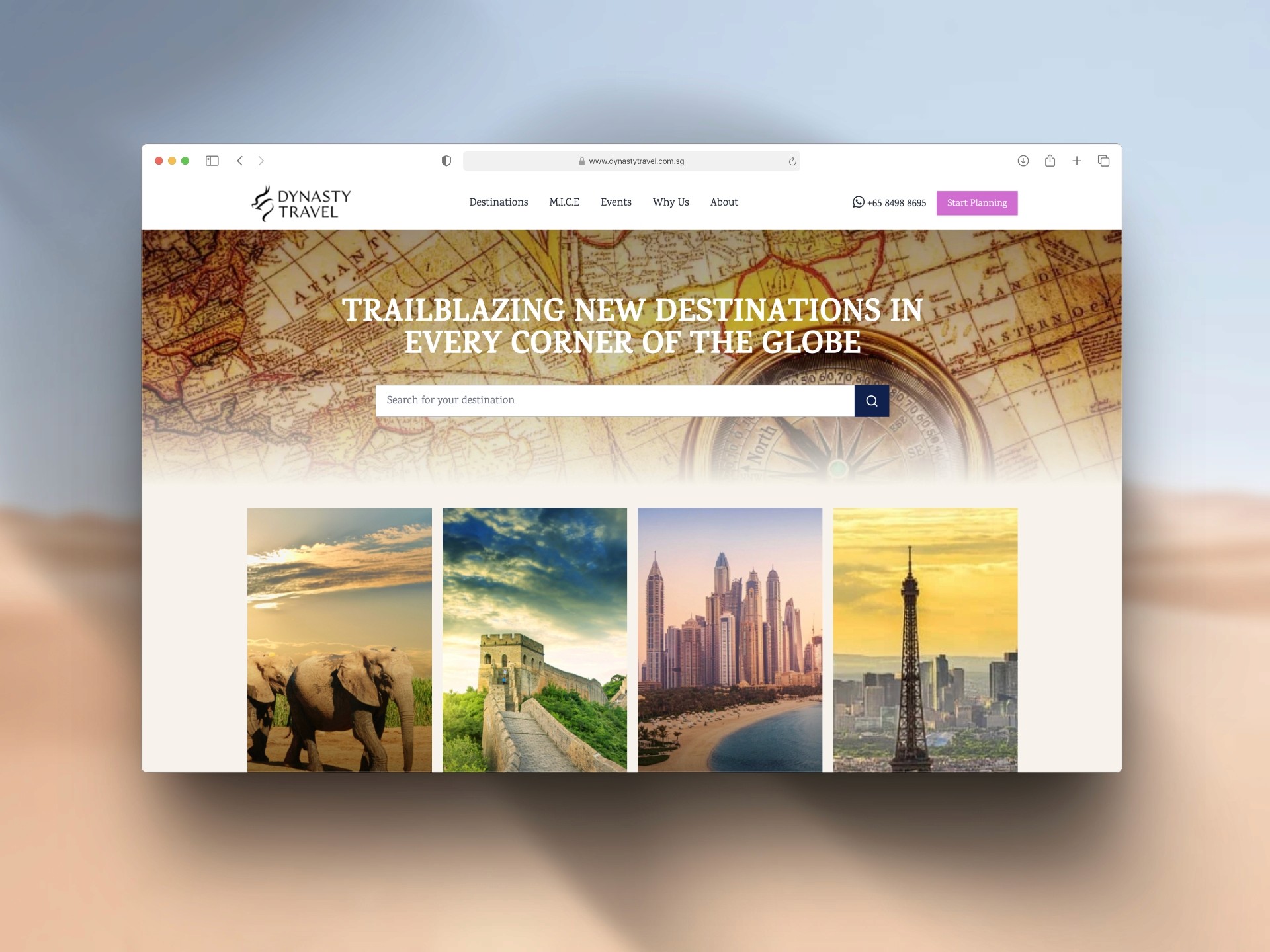
A full rebuild structured around the rebrand, with trip pages designed to guide visitors through detailed itineraries in a way that felt easy to follow and persuasive to act on.

Client

Dynasty Travel

Industry

Travel & Tour

Year

2024

CREDITS

Pi Tha

project brief

Dynasty Travel is a legacy travel and tour agency based in Singapore with deep roots in curated, experience-first travel. Following a full rebrand that shifted their positioning from budget-friendly to a full-service premium operator, they needed a website that matched that new identity. The scope covered everything from ultra-premium bespoke tours to family and solo packages, targeting a wider range of travellers than before. The brief was a complete site rebuild from sitemap to launch, with particular focus on individual trip pages that could carry rich day-by-day itineraries and convert visitors into enquiries.
What the icon stands for

What our iconstands for

The mark combines three overlapping ellipses, each colour representing one of STS's three age groups, nursery through to year two. The shape is built on the letterform S and draws from the visual metaphor of stacked stepping stones, which is where the school gets its name.

=

=

Scalable Identity System

Logo Variations

color palette

#823439

#823439

#823439

#823439

#823439

#823439

Tint & Shade

20% lightness increments

Typography

primary type face

Cooper Hewitt

Hierarchy & Weight

Aa

Thin

Aa

Regular

Aa

Semi-Bold

Aa

Heavy

What Wasn't Working

The old site was built for a different version of the business. It was transactional and flat, presenting trips as listings rather than experiences. The new brand positioning was built around the idea of going beyond postcard destinations, handcrafted itineraries, secret local gems, deep ties with communities. None of that came through on the site. Visitors landed and saw a generic travel agency, not the curated, premium operator that the rebrand was trying to communicate.

Trip pages were the core conversion point and they were failing. The information was all there and none of it sold. A trip page read like a packing list. Nothing on it moved a visitor from browsing to booking.

Roles & Responsibility

As a Project Lead, I owned the full pipeline from start to finish.

Creative Direction: Defining the visual language, layout, and overall site experience.

Client Management: Leading briefs, presenting concepts, and aligning on direction throughout.

Team Assembly: Sourcing and onboarding the Webflow developer and animator.

Production Oversight: Briefing the build team and ensuring designs translated correctly into Webflow.

Quality Assurance: Balancing visual ambition against site speed, making sure every interaction held up in the browser.

What Wasn't Working

The old site was built for a different version of the business. It was transactional and flat, presenting trips as listings rather than experiences. The new brand positioning was built around the idea of going beyond postcard destinations, handcrafted itineraries, secret local gems, deep ties with communities. None of that came through on the site. Visitors landed and saw a generic travel agency, not the curated, premium operator that the rebrand was trying to communicate.

Trip pages were the core conversion point and they were failing. The information was all there and none of it sold. A trip page read like a packing list. Nothing on it moved a visitor from browsing to booking.

How I Fixed It

Starting from the sitemap, I restructured the entire site around the new positioning and the full range of audience types, from solo explorers to family groups to bespoke high-end travellers. Each section was designed to do a specific job.

Trip pages were rebuilt from the ground up around the traveller's decision journey. They led with destination mood and experience before getting into logistics, using the itinerary itself as a storytelling device rather than a specification sheet. Day-by-day layouts were designed to be detailed and thorough without feeling overwhelming, giving visitors the confidence that every moment of the trip had been thought through. The trip planners' expertise was surfaced throughout, reinforcing that this wasn't a booking platform but a team of people who actually knew these destinations.

Roles & Responsibility

As Web Designer, I worked directly with the client (company) and development team across the full project.

Creative Direction: Defining the visual language and page structure to match the premium repositioning.

Stakeholder Management: Leading briefs, presenting directions, and maintaining alignment throughout.

Content Architecture: Building itinerary page structures that balanced richness with readability.

Interactive Itinerary

Scalable Identity System

Logo Variations

Primary Lockup

Icon-only

Vertical Lockup

color palette

#823439

#823439

#823439

#823439

#823439

#823439

Tint & Shade

20% lightness increments

Typography

primary type face

Cooper Hewitt

Hierarchy & Weight

Aa

Thin

Aa

Regular

Aa

Semi-Bold

Aa

Heavy

Scalable Identity System

Logo Variations

Primary Lockup

Icon-only

Vertical Lockup

color palette

#823439

#823439

#823439

#823439

#823439

#823439

Tint & Shade

20% lightness increments

Typography

primary type face

Cooper Hewitt

Hierarchy & Weight

Aa

Thin

Aa

Regular

Aa

Semi-Bold

Aa

Heavy

How I Built It

How I Built It

logo in use

logo in use

final thoughts

Have a project in mind?