Voyage Bar
Voyage Bar
Voyage Bar

Eternal Website

Eternal Website

Web Design & Development

Creative Direction

Challenge

The brand identity was sharp. The site wasn't. For a premium Apple reseller, the old online presence couldn't hold up the Apple-adjacent positioning that the rebrand had built toward.

outcome

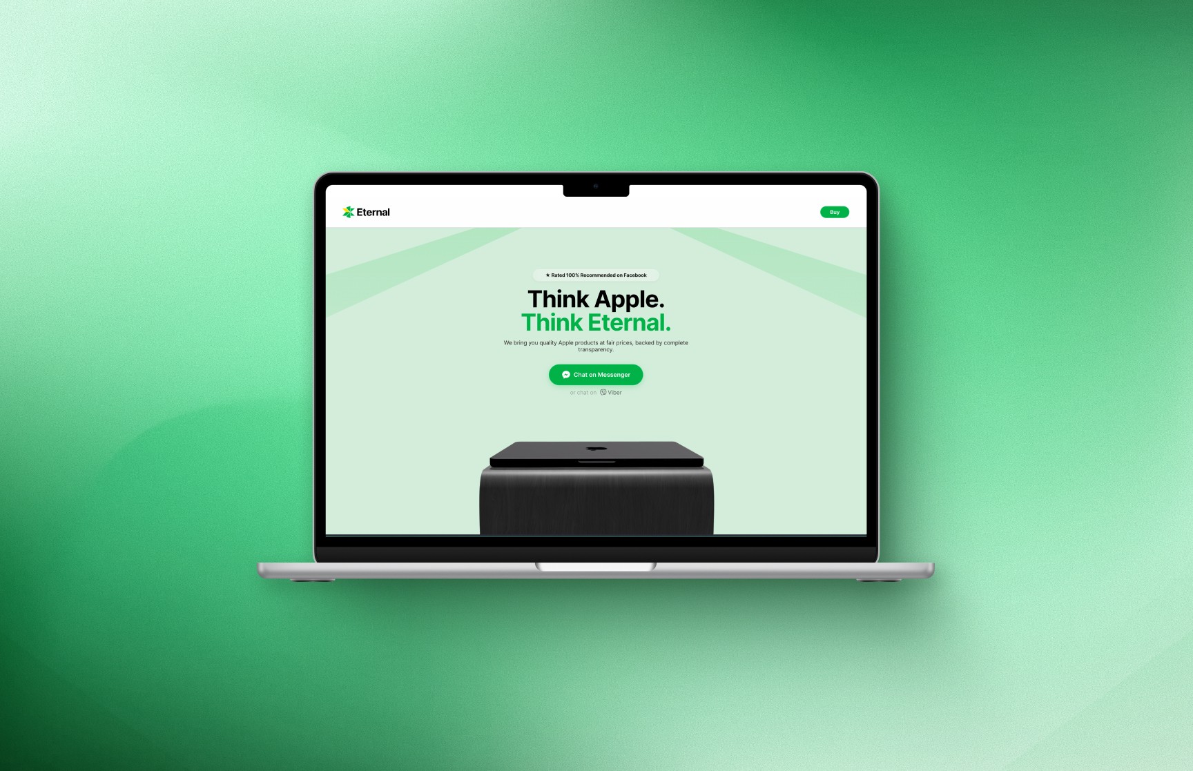
Built from scratch using Next.js and Three.js. Interaction-rich, product-first, and intentionally Apple-inspired without copying it. The site finally matched the brand.

Client

Eternal

Industry

Technology/ Retail

Year

2026

project brief

Eternal is a premium Apple reseller based in Yangon, Myanmar, selling brand new and rigorously tested second-hand Apple devices with full warranty, transparent pricing, and a 100% recommended rating on Facebook. Every unit is sourced through Apple-authorized distributors. Following a full brand identity built around the positioning of "Think Apple. Think Eternal," they needed a site that could carry that positioning into a full digital experience. The client wanted interactions, energy, and the kind of freshness you associate with Apple itself. The brief was a complete build from scratch, designed and built solo.

What the icon stands for

What our iconstands for

The mark combines three overlapping ellipses, each colour representing one of STS's three age groups, nursery through to year two. The shape is built on the letterform S and draws from the visual metaphor of stacked stepping stones, which is where the school gets its name.

=

=

Scalable Identity System

Logo Variations

color palette

#823439

#823439

#823439

#823439

#823439

#823439

Tint & Shade

20% lightness increments

Typography

primary type face

Cooper Hewitt

Hierarchy & Weight

Aa

Thin

Aa

Regular

Aa

Semi-Bold

Aa

Heavy

What Wasn't Working

The brand identity had set a clear standard. Premium, minimal, Apple-adjacent in every detail. The old online presence sat at the opposite end of that spectrum. For a business whose entire value proposition is built on trust, quality, and the Apple ecosystem, a site that looked nothing like what it was selling was undermining the brand at the most critical point of the customer journey. Buyers in Myanmar are making significant purchasing decisions and the site wasn't giving them confidence to commit.

Beyond the visual gap, there was no product browsing experience to speak of. Customers couldn't explore the range, compare options, or understand what made Eternal's offering worth choosing over a generic reseller. Customers trusted the counter more than the website, and for a premium positioning that is backwards.

Roles & Responsibility

As a Project Lead, I owned the full pipeline from start to finish.

Creative Direction: Defining the visual language, layout, and overall site experience.

Client Management: Leading briefs, presenting concepts, and aligning on direction throughout.

Team Assembly: Sourcing and onboarding the Webflow developer and animator.

Production Oversight: Briefing the build team and ensuring designs translated correctly into Webflow.

Quality Assurance: Balancing visual ambition against site speed, making sure every interaction held up in the browser.

What Wasn't Working

The brand identity had set a clear standard. Premium, minimal, Apple-adjacent in every detail. The old online presence sat at the opposite end of that spectrum. For a business whose entire value proposition is built on trust, quality, and the Apple ecosystem, a site that looked nothing like what it was selling was undermining the brand at the most critical point of the customer journey. Buyers in Myanmar are making significant purchasing decisions and the site wasn't giving them confidence to commit.

Beyond the visual gap, there was no product browsing experience to speak of. Customers couldn't explore the range, compare options, or understand what made Eternal's offering worth choosing over a generic reseller. Customers trusted the counter more than the website, and for a premium positioning that is backwards.

How I Fixed It

I built the site from scratch using Next.js with AI-assisted development, including custom 3D assets built in Three.js. The product browsing experience was designed to be clean, fast, and easy to act on, organized by category and built to let the products speak without unnecessary clutter. Trust signals were embedded throughout, warranty coverage, sourcing transparency, and customer reviews were all surfaced naturally rather than buried in fine print.

Every interaction was designed to reinforce the premium positioning without working against load performance. The result was a site that opened the way the brand intended: like an Apple launch, scaled to Yangon.

Roles & Responsibility

As a Project Lead, I owned the full pipeline from start to finish:

Creative Direction: Defining the visual language, interaction design, and overall site experience.
Web Development: Full site built in Next.js with AI-assisted development throughout.
3D Asset Creation: Custom product and hero assets built in Three.js.
Quality Assurance: Balancing interaction richness against load performance at every stage of the build.

Scalable Identity System

Logo Variations

Primary Lockup

Icon-only

Vertical Lockup

color palette

#823439

#823439

#823439

#823439

#823439

#823439

Tint & Shade

20% lightness increments

Typography

primary type face

Cooper Hewitt

Hierarchy & Weight

Aa

Thin

Aa

Regular

Aa

Semi-Bold

Aa

Heavy

Scalable Identity System

Logo Variations

Primary Lockup

Icon-only

Vertical Lockup

color palette

#823439

#823439

#823439

#823439

#823439

#823439

Tint & Shade

20% lightness increments

Typography

primary type face

Cooper Hewitt

Hierarchy & Weight

Aa

Thin

Aa

Regular

Aa

Semi-Bold

Aa

Heavy

How I Built It

How I Built It

logo in use

logo in use

final thoughts

Have a project in mind?