Voyage Bar
Voyage Bar
Voyage Bar

Kids & Us

Kids & Us

Web Design

Challenge

An international brand entering a new market with templates built for Western audiences. The existing site didn't speak to Asian parents or kids.

outcome

A regional site that keeps the global brand intact and speaks to Myanmar families in their own context. It earns a parent's trust before it asks for an enrollment.

Client

Kids&Us Asia

Industry

Education

Year

2022

CREDITS

Myo Kyaw

project brief

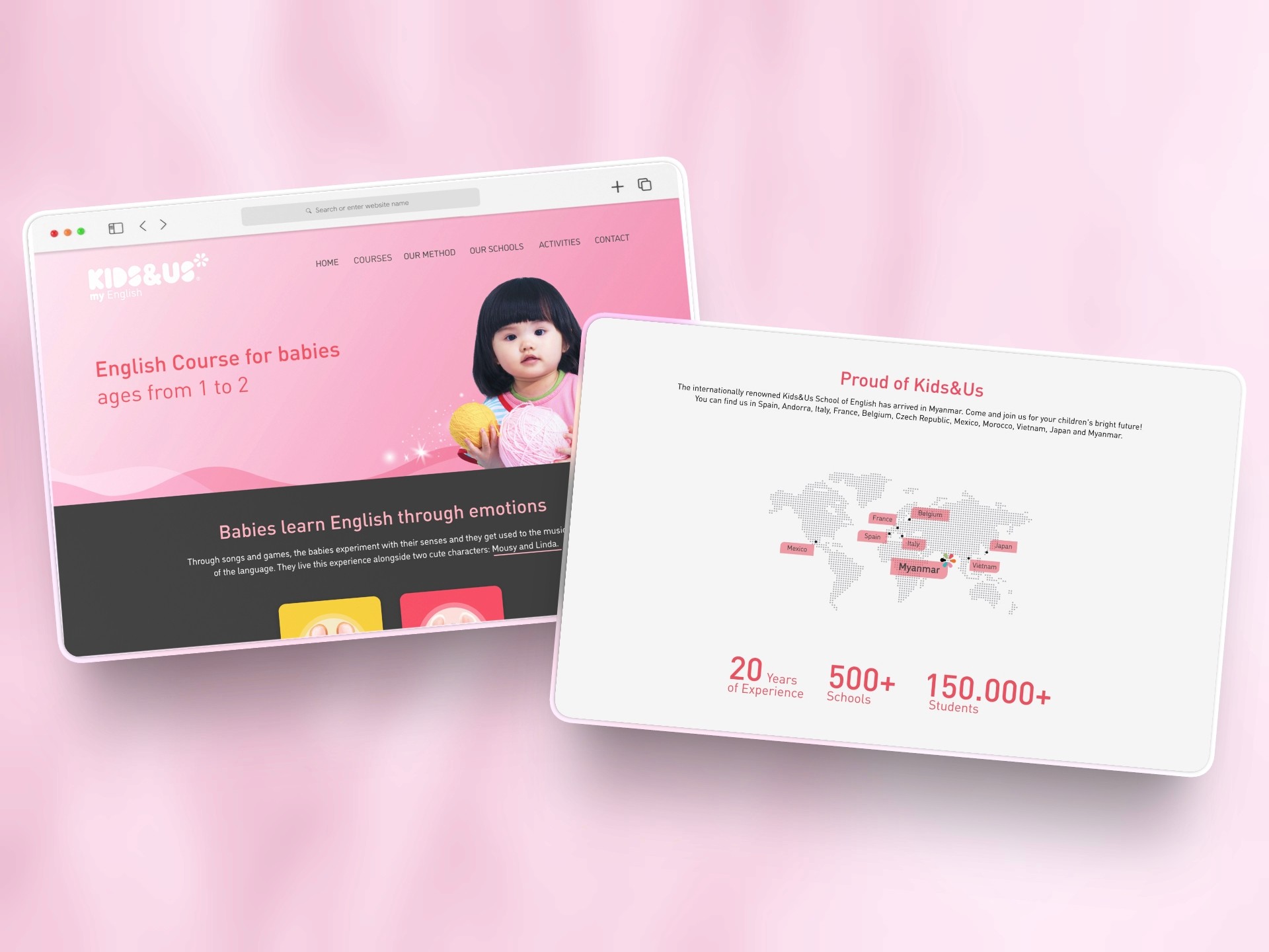
Kids & Us is an international English language school with 800+ locations across 11 countries and over 180,000 students worldwide, built around a natural language acquisition method that takes children from babies through to teens. Entering Myanmar meant building a regional site that maintained strict global brand standards while speaking directly to local parents, a market with different cultural expectations, different concerns about international education, and a very different relationship with foreign school brands.
What the icon stands for

What our iconstands for

The mark combines three overlapping ellipses, each colour representing one of STS's three age groups, nursery through to year two. The shape is built on the letterform S and draws from the visual metaphor of stacked stepping stones, which is where the school gets its name.

=

=

Scalable Identity System

Logo Variations

color palette

#823439

#823439

#823439

#823439

#823439

#823439

Tint & Shade

20% lightness increments

Typography

primary type face

Cooper Hewitt

Hierarchy & Weight

Aa

Thin

Aa

Regular

Aa

Semi-Bold

Aa

Heavy

What Wasn't Working

The global template was engineered for European parents. The content hierarchy, the tone, the imagery, all of it reflected a Western family's priorities and decision-making patterns. For a Myanmar parent considering an international English school, nothing on the site acknowledged their context. There was no sense of local presence, no reassurance about how the method worked for Asian learners, and no clear explanation of what made Kids & Us different from local alternatives.

The course structure was also not immediately clear. Parents needed to understand which program suited their child's age and level, but the site buried that information rather than leading with it. For a school competing on the strength of its method, the site was doing a poor job of communicating what that method actually was.

Roles & Responsibility

As a Project Lead, I owned the full pipeline from start to finish.

Creative Direction: Defining the visual language, layout, and overall site experience.

Client Management: Leading briefs, presenting concepts, and aligning on direction throughout.

Team Assembly: Sourcing and onboarding the Webflow developer and animator.

Production Oversight: Briefing the build team and ensuring designs translated correctly into Webflow.

Quality Assurance: Balancing visual ambition against site speed, making sure every interaction held up in the browser.

What Wasn't Working

The global template was engineered for European parents. The content hierarchy, the tone, the imagery, all of it reflected a Western family's priorities and decision-making patterns. For a Myanmar parent considering an international English school, nothing on the site acknowledged their context. There was no sense of local presence, no reassurance about how the method worked for Asian learners, and no clear explanation of what made Kids & Us different from local alternatives.

The course structure was also not immediately clear. Parents needed to understand which program suited their child's age and level, but the site buried that information rather than leading with it. For a school competing on the strength of its method, the site was doing a poor job of communicating what that method actually was.

How I Fixed It

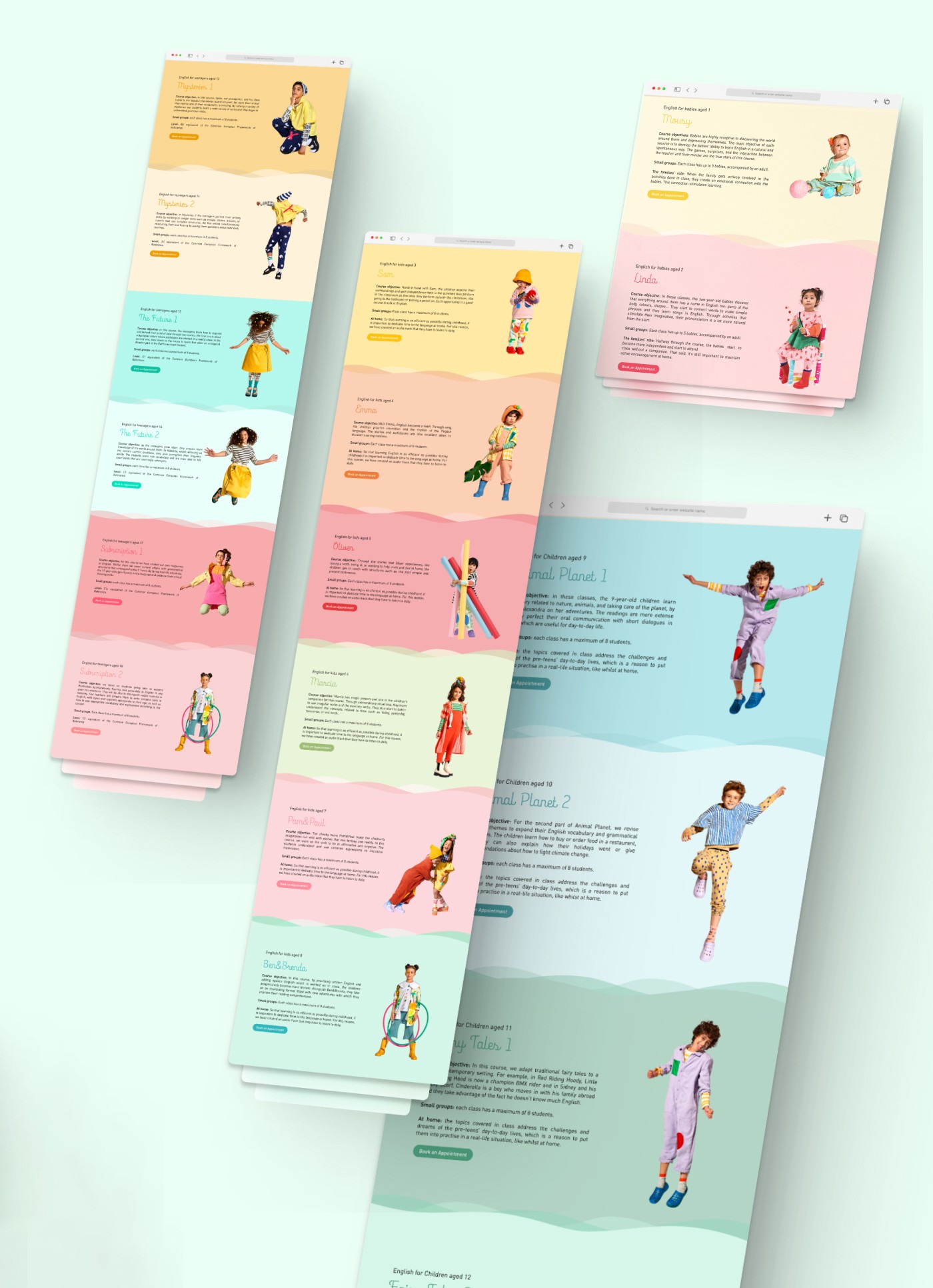
I restructured the site around the local audience's decision journey, starting with trust and credibility before moving into program detail. The course structure was reorganized by age group and made immediately navigable, so parents could land and find the right program without hunting. The learning method was given dedicated space and explained in a way that resonated with how Asian parents think about education: structured, progressive, and outcome-driven.

The visual language stayed brand-consistent but was adapted to feel genuinely welcoming to kids and parents in the region rather than borrowed from a European market. Every section was written with a Myanmar parent in mind, not translated from a global brief.

Roles & Responsibility

As a Web Designer, I managed the full project from brief to delivery, balancing global brand requirements with local market needs.

Creative Direction: Adapting the global visual language for a Southeast Asian audience without breaking brand consistency.
Stakeholder Management: Aligning the local franchise owners with the international brand team throughout the project.
Content Adaptation: Restructuring course information, methodology copy, and trust signals for local relevance.
Production Oversight: Briefing and managing the development team to final launch.

Scalable Identity System

Logo Variations

Primary Lockup

Icon-only

Vertical Lockup

color palette

#823439

#823439

#823439

#823439

#823439

#823439

Tint & Shade

20% lightness increments

Typography

primary type face

Cooper Hewitt

Hierarchy & Weight

Aa

Thin

Aa

Regular

Aa

Semi-Bold

Aa

Heavy

Scalable Identity System

Logo Variations

Primary Lockup

Icon-only

Vertical Lockup

color palette

#823439

#823439

#823439

#823439

#823439

#823439

Tint & Shade

20% lightness increments

Typography

primary type face

Cooper Hewitt

Hierarchy & Weight

Aa

Thin

Aa

Regular

Aa

Semi-Bold

Aa

Heavy

How I Built It

How I Built It

logo in use

logo in use

final thoughts

Have a project in mind?