Voyage Bar
Voyage Bar
Voyage Bar

Linkers

Linkers

Web Design

Creative Direction

Challenge

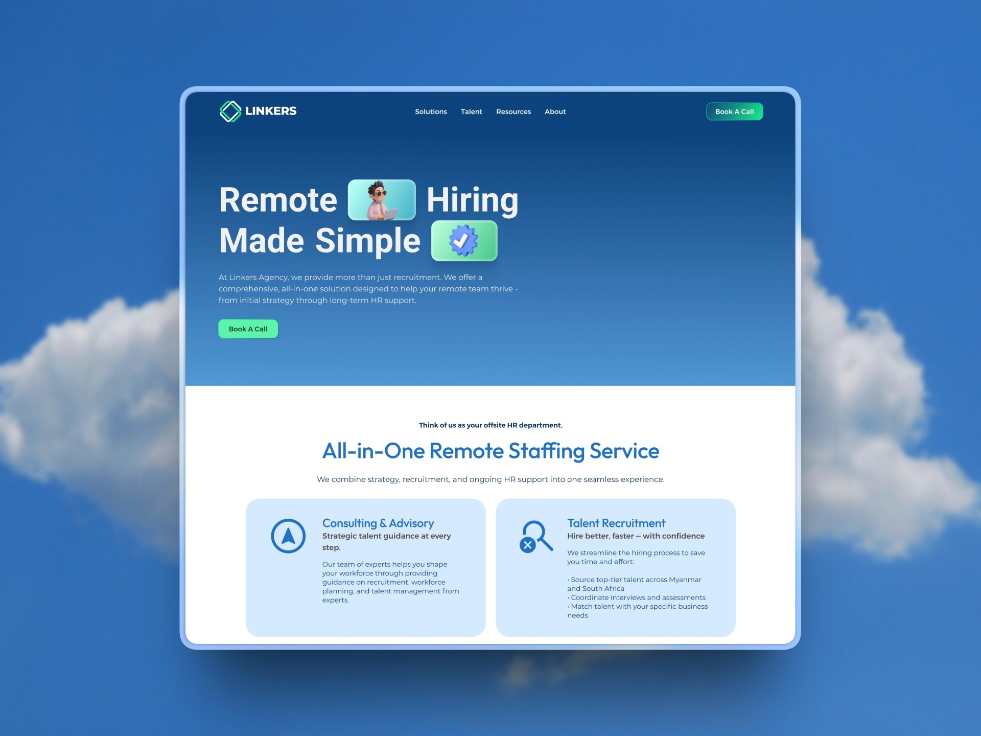
Two audiences, one site, no clear structure for either. Employers weren't booking calls. Talent weren't submitting CVs. The site looked too dated to attract the young professionals they were targeting.

outcome

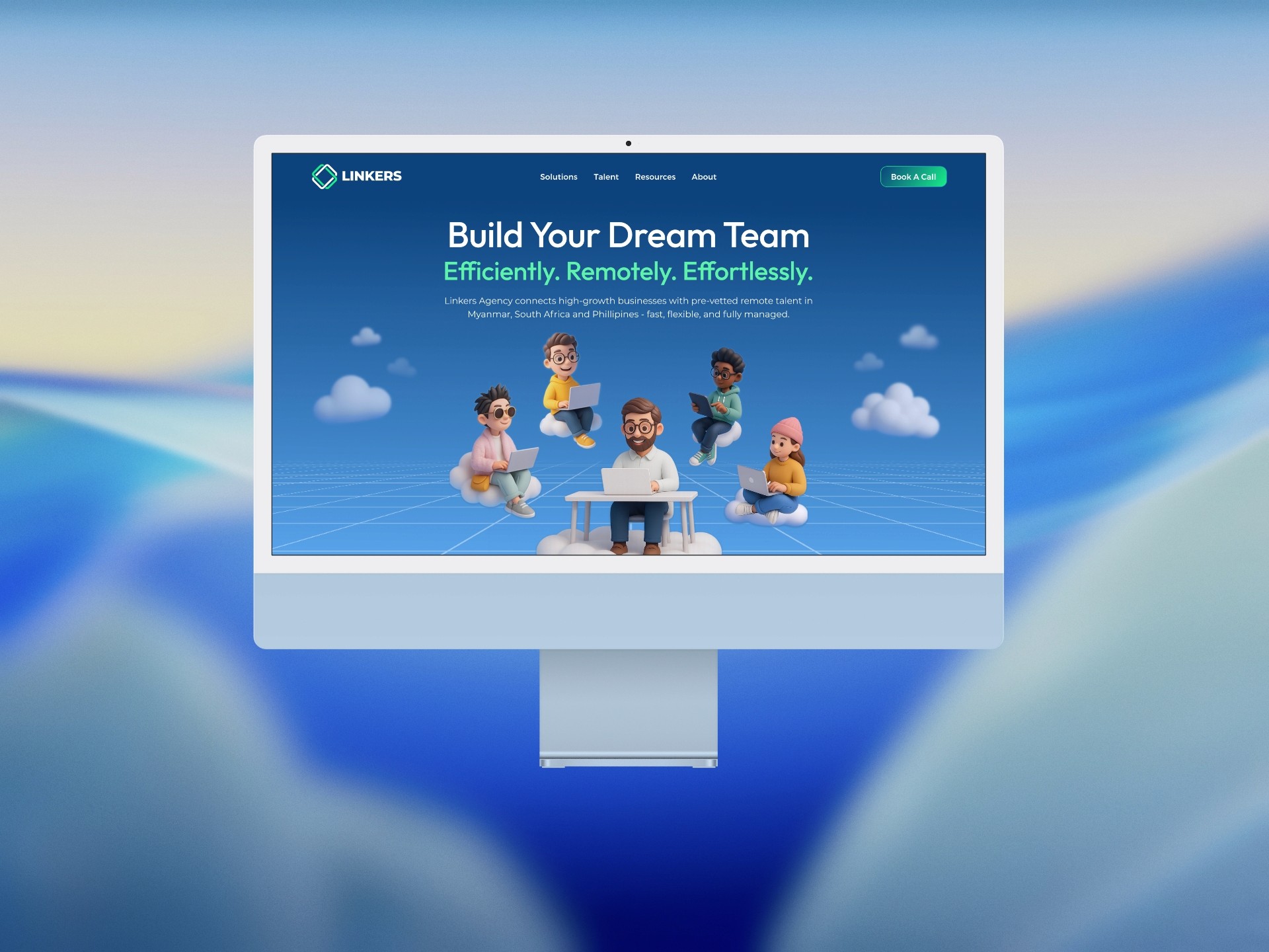
A restructured site with a clear dual-audience flow. Each visitor type had a direct path to the right action, with a visual language modern enough to attract younger talent.

Client

Xplore Asia

Industry

Recruitment / HR

Year

2025

project brief

Linkers is a boutique outsourcing and remote staffing agency based in Thailand, connecting businesses across the UK, Singapore, Australia, and South Korea with skilled remote professionals from Myanmar, the Philippines, and South Africa. Their model serves two completely different audiences on the same platform: growing SMEs looking to build offshore teams, and young professionals looking for remote opportunities with international clients. The old site wasn't converting either group. The brief was a full redesign from sitemap to Figma handoff, ready for development.

What the icon stands for

What our iconstands for

The mark combines three overlapping ellipses, each colour representing one of STS's three age groups, nursery through to year two. The shape is built on the letterform S and draws from the visual metaphor of stacked stepping stones, which is where the school gets its name.

=

=

Scalable Identity System

Logo Variations

color palette

#823439

#823439

#823439

#823439

#823439

#823439

Tint & Shade

20% lightness increments

Typography

primary type face

Cooper Hewitt

Hierarchy & Weight

Aa

Thin

Aa

Regular

Aa

Semi-Bold

Aa

Heavy

What Wasn't Working

Employers and jobseekers landed on the same homepage and got the same pitch. Neither could tell the site was built for them, so neither acted. For businesses, there was no clear explanation of how Linkers worked, no visible process, no trust signals that would give a founder or operations manager the confidence to book a call and hand over a function of their business to a remote team they'd never met. The value proposition was there but buried.

For talent, the problem was different but equally damaging. Linkers was positioning itself as the gateway to international remote work for young professionals from emerging markets. But the site looked a decade old. It wasn't aspirational, it wasn't modern, and it wasn't communicating the kind of opportunity that a talented young professional would take seriously. The visual gap between what the brand was promising and what the site was delivering was actively working against recruitment.

Roles & Responsibility

As a Project Lead, I owned the full pipeline from start to finish.

Creative Direction: Defining the visual language, layout, and overall site experience.

Client Management: Leading briefs, presenting concepts, and aligning on direction throughout.

Team Assembly: Sourcing and onboarding the Webflow developer and animator.

Production Oversight: Briefing the build team and ensuring designs translated correctly into Webflow.

Quality Assurance: Balancing visual ambition against site speed, making sure every interaction held up in the browser.

What Wasn't Working

Employers and jobseekers landed on the same homepage and got the same pitch. Neither could tell the site was built for them, so neither acted. For businesses, there was no clear explanation of how Linkers worked, no visible process, no trust signals that would give a founder or operations manager the confidence to book a call and hand over a function of their business to a remote team they'd never met. The value proposition was there but buried.

For talent, the problem was different but equally damaging. Linkers was positioning itself as the gateway to international remote work for young professionals from emerging markets. But the site looked a decade old. It wasn't aspirational, it wasn't modern, and it wasn't communicating the kind of opportunity that a talented young professional would take seriously. The visual gap between what the brand was promising and what the site was delivering was actively working against recruitment.

How I Fixed It

I rebuilt the site from the sitemap up around two distinct user journeys that shared the same space without creating confusion. The homepage was designed to split intent clearly and quickly, giving both audiences an immediate sense that this site was built for them.

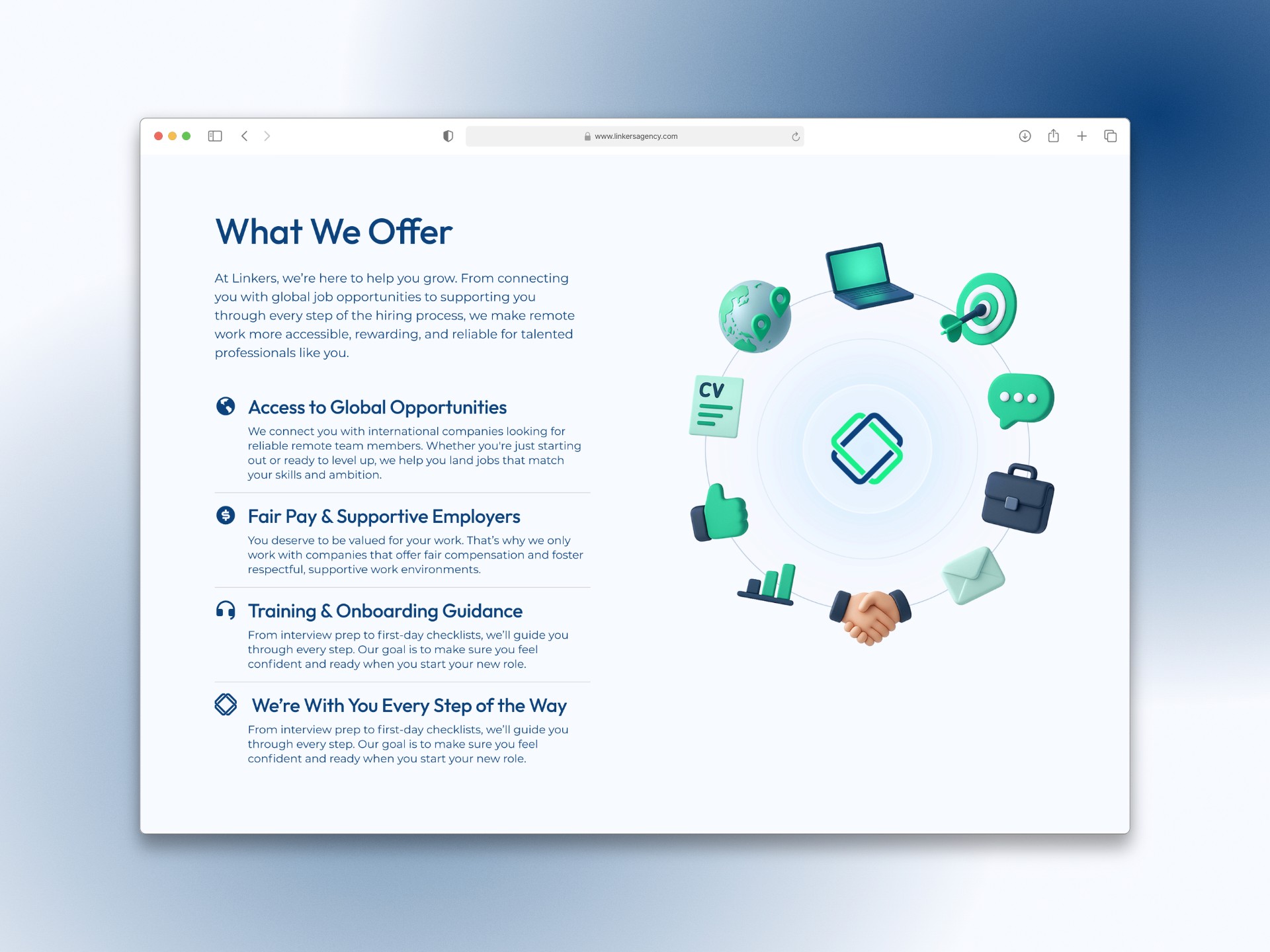
The employer-facing sections were restructured around the decision journey of a business owner considering outsourcing for the first time. Process transparency, trust signals, testimonials from existing clients, and a clear path to a consultation were all brought forward. The talent-facing sections were rebuilt to feel genuinely modern and opportunity-driven, showing candidates the same thing the brand promised them: international clients, real careers, work worth leaving a local job for.

Roles & Responsibility

As a Web Designer, I delivered production-ready Figma files covering the full site, from sitemap to final screen.

Information Architecture: Sitemap and page structure designed around dual audiences without creating confusion.

Creative Direction: Modernising the visual language to attract younger talent while maintaining credibility for business clients.

Design Handoff: Full Figma delivery with dev-ready specs and annotations across every screen.

Scalable Identity System

Logo Variations

Primary Lockup

Icon-only

Vertical Lockup

color palette

#823439

#823439

#823439

#823439

#823439

#823439

Tint & Shade

20% lightness increments

Typography

primary type face

Cooper Hewitt

Hierarchy & Weight

Aa

Thin

Aa

Regular

Aa

Semi-Bold

Aa

Heavy

Scalable Identity System

Logo Variations

Primary Lockup

Icon-only

Vertical Lockup

color palette

#823439

#823439

#823439

#823439

#823439

#823439

Tint & Shade

20% lightness increments

Typography

primary type face

Cooper Hewitt

Hierarchy & Weight

Aa

Thin

Aa

Regular

Aa

Semi-Bold

Aa

Heavy

How I Built It

How I Built It

logo in use

logo in use

final thoughts

Have a project in mind?