Voyage Bar
Voyage Bar
Voyage Bar

Emergent Films

Emergent Films

Web Design

Creative Direction

Challenge

The reel was world-class. The website wasn't. For a production house working with Google, Riot Games, and Disney, the gap between the work and the site it lived on was impossible to ignore.

outcome

A complete rebuild that closed that gap. New structure, interactive elements and new works system with dedicated category pages. Cinematic on screen, fast in the browser.

Client

Emergent Films

Industry

Video Production

Year

2026

project brief

Emergent Films is an award-winning film production house based in Singapore with a second office in Bangkok, working with some of the biggest brands in the region including Google, Riot Games, Canon Asia, Disney, and HBO. They needed a website that could hold its own against that reputation. The existing site had a foundation but lacked the immersive, cinematic quality you'd expect from a production house operating at that level. Content was thin across the board, which was hurting both the user experience and search visibility. The ask was a significant redesign, rebuilding the site from a basic portfolio into a fully immersive digital experience worthy of the work it was showcasing.

What the icon stands for

What our iconstands for

The mark combines three overlapping ellipses, each colour representing one of STS's three age groups, nursery through to year two. The shape is built on the letterform S and draws from the visual metaphor of stacked stepping stones, which is where the school gets its name.

=

=

Scalable Identity System

Logo Variations

color palette

#823439

#823439

#823439

#823439

#823439

#823439

Tint & Shade

20% lightness increments

Typography

primary type face

Cooper Hewitt

Hierarchy & Weight

Aa

Thin

Aa

Regular

Aa

Semi-Bold

Aa

Heavy

What Wasn't Working

The site had content but no conviction. The works were buried in a flat filtered grid with no hierarchy, no narrative, and no way to navigate meaningfully by category. For a production house whose output spanned commercials, branded content, events, BTS, and short film, there was no structure that helped a potential client find what was relevant to them. Everything was flattened into the same grid regardless of type or scale.

Content thinness was a compounding problem. Beyond the works themselves, the site didn't give visitors enough context about who Emergent Films was, what they stood for, or why their roster looked the way it did. That wasn't just a user experience issue. Thin content meant poor search visibility, which meant the site was underperforming even for people actively looking for a production house in Singapore.

The about page was doing the job of three pages badly. Services, team, and company story were all compressed into a single page that served none of them well. For a studio expanding into Bangkok and growing their team, there was no space on the site to communicate that scale.

Roles & Responsibility

As a Project Lead, I owned the full pipeline from start to finish.

Creative Direction: Defining the visual language, layout, and overall site experience.

Client Management: Leading briefs, presenting concepts, and aligning on direction throughout.

Team Assembly: Sourcing and onboarding the Webflow developer and animator.

Production Oversight: Briefing the build team and ensuring designs translated correctly into Webflow.

Quality Assurance: Balancing visual ambition against site speed, making sure every interaction held up in the browser.

What Wasn't Working

The site had content but no conviction. The works were buried in a flat filtered grid with no hierarchy, no narrative, and no way to navigate meaningfully by category. For a production house whose output spanned commercials, branded content, events, BTS, and short film, there was no structure that helped a potential client find what was relevant to them. Everything was flattened into the same grid regardless of type or scale.

Content thinness was a compounding problem. Beyond the works themselves, the site didn't give visitors enough context about who Emergent Films was, what they stood for, or why their roster looked the way it did. That wasn't just a user experience issue. Thin content meant poor search visibility, which meant the site was underperforming even for people actively looking for a production house in Singapore.

The about page was doing the job of three pages badly. Services, team, and company story were all compressed into a single page that served none of them well. For a studio expanding into Bangkok and growing their team, there was no space on the site to communicate that scale.

How I Fixed It

I started with structure. The works section was rebuilt into dedicated category pages, each with autoplay previews so the work started speaking the moment a visitor landed. Adding BTS and Short Film as new categories gave the full breadth of Emergent's output somewhere to live and made it easier for the right clients to find the right work quickly.

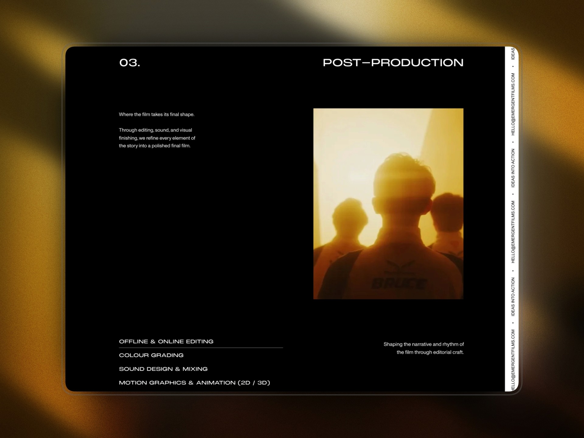
The about page was split into About and Services, giving each the room it needed. The Services page was built to cover the full production pipeline: pre-production, production, and post-production, with enough detail to help potential clients understand what a collaboration would actually look like. Content was expanded across every page to add depth, context, and searchability without losing the cinematic visual quality the brand needed to maintain.

Every interaction across the site was designed with load performance in mind. The autoplay grid, the transitions, the hero sequences, all of it was built to feel immersive without creating the kind of performance overhead that would work against the experience on a slower connection.

Roles & Responsibility

As a Project Lead, I owned the full pipeline from start to finish:

Creative Direction: Defining the visual language, layout, and overall site experience.

Client Management: Leading briefs, presenting concepts, and aligning on direction throughout.

Team Assembly: Sourcing and onboarding the Webflow developer and animator.

Production Oversight: Briefing the build team and ensuring designs translated correctly into Webflow.

Quality Assurance: Balancing visual ambition against site speed, making sure every interaction held up in the browser.

Scalable Identity System

Logo Variations

Primary Lockup

Icon-only

Vertical Lockup

color palette

#823439

#823439

#823439

#823439

#823439

#823439

Tint & Shade

20% lightness increments

Typography

primary type face

Cooper Hewitt

Hierarchy & Weight

Aa

Thin

Aa

Regular

Aa

Semi-Bold

Aa

Heavy

Scalable Identity System

Logo Variations

Primary Lockup

Icon-only

Vertical Lockup

color palette

#823439

#823439

#823439

#823439

#823439

#823439

Tint & Shade

20% lightness increments

Typography

primary type face

Cooper Hewitt

Hierarchy & Weight

Aa

Thin

Aa

Regular

Aa

Semi-Bold

Aa

Heavy

How I Built It

How I Built It

logo in use

logo in use

final thoughts

Have a project in mind?