Voyage Bar
Voyage Bar
Voyage Bar

The Connecting Line

The Connecting Line

Creative Direction

Brand Development

Challenge

A fresh identity, a refined mark, a good tagline, and no way to express any of it in the wild. On social and in print, the brand was a logo placed on a photo. Nothing moved, nothing connected.

outcome

A single flowing line, drawn to link places and people, that grew from one carousel concept into the brand's second signature. Wherever the brand shows up now, the line is already moving through it.

Client

Dynasty Travel

Industry

Travel & Tourism

Year

2023

project brief

Dynasty Travel is an award-winning travel and tour agency in Singapore, positioned around curated, experience-first journeys under the promise "Travel Well. Learn More. Do Good." The brand identity, built around an elegant dragon-inspired mark, was developed before I joined. My job was to bring it to life. What started as a brief for social media carousels became something bigger: a graphic device that expressed what the executives believed the business actually was, a company that connects people to places. The line became the visual proof of that idea, and it spread from Instagram to tour booklets, gift vouchers, envelopes, and regional promotion events.

What the icon stands for

What our iconstands for

The mark combines three overlapping ellipses, each colour representing one of STS's three age groups, nursery through to year two. The shape is built on the letterform S and draws from the visual metaphor of stacked stepping stones, which is where the school gets its name.

=

=

Drag to follow the line.

Drag to follow the line.

Drag to follow the line.

Drag to follow the line.

Seamless Experience

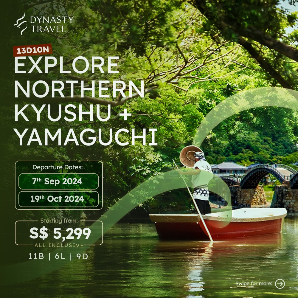
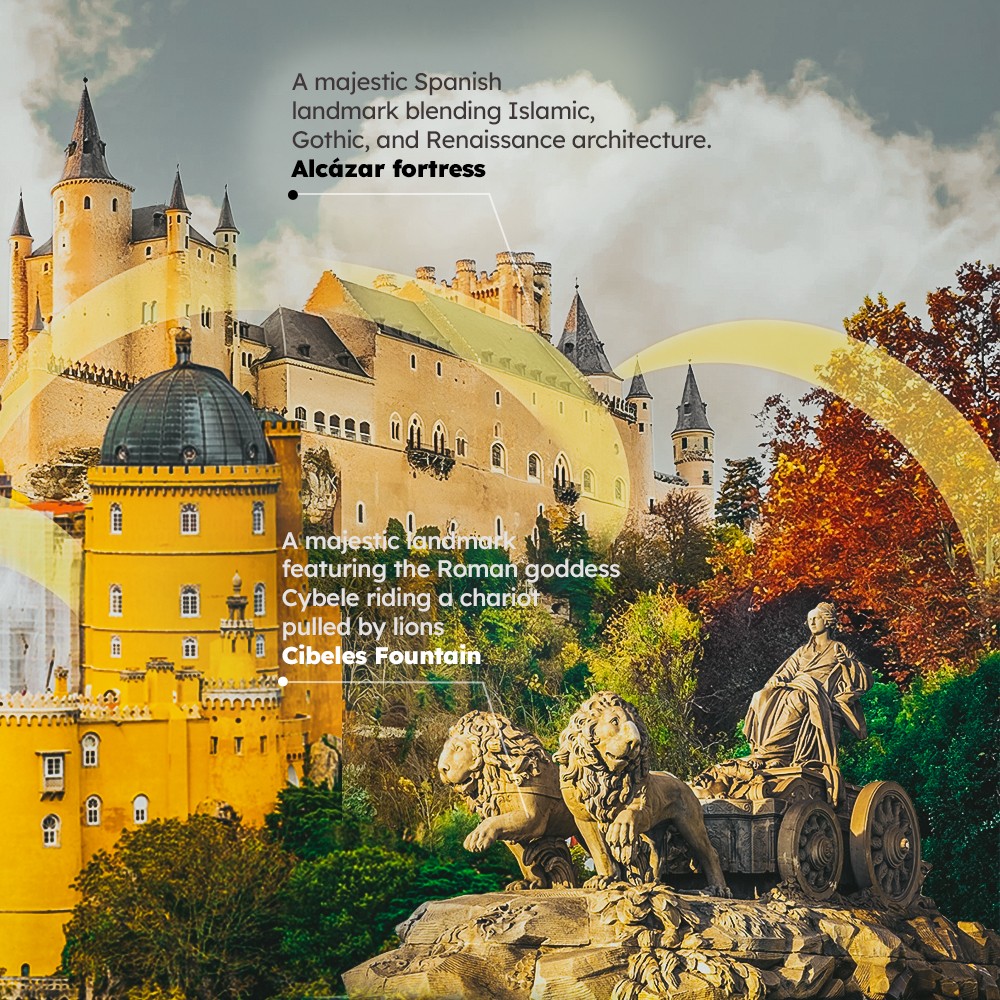
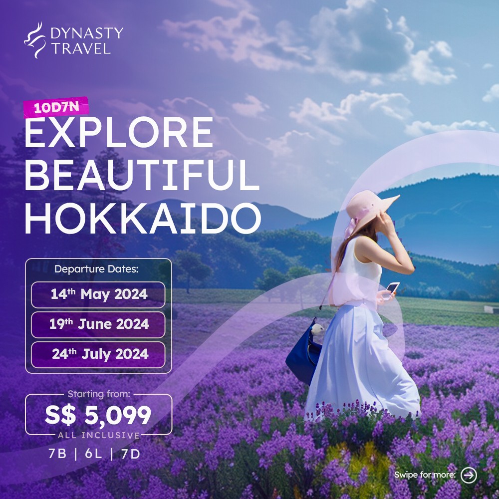
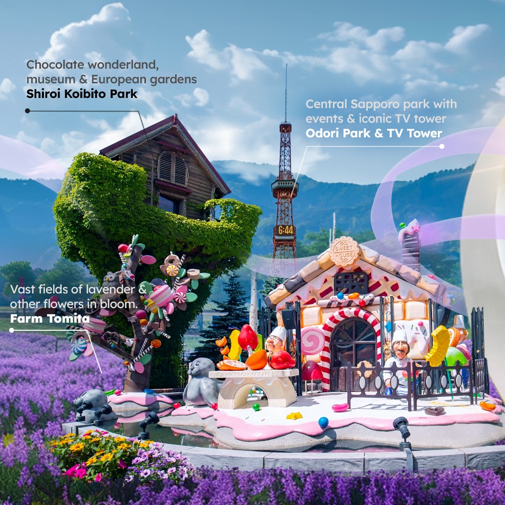
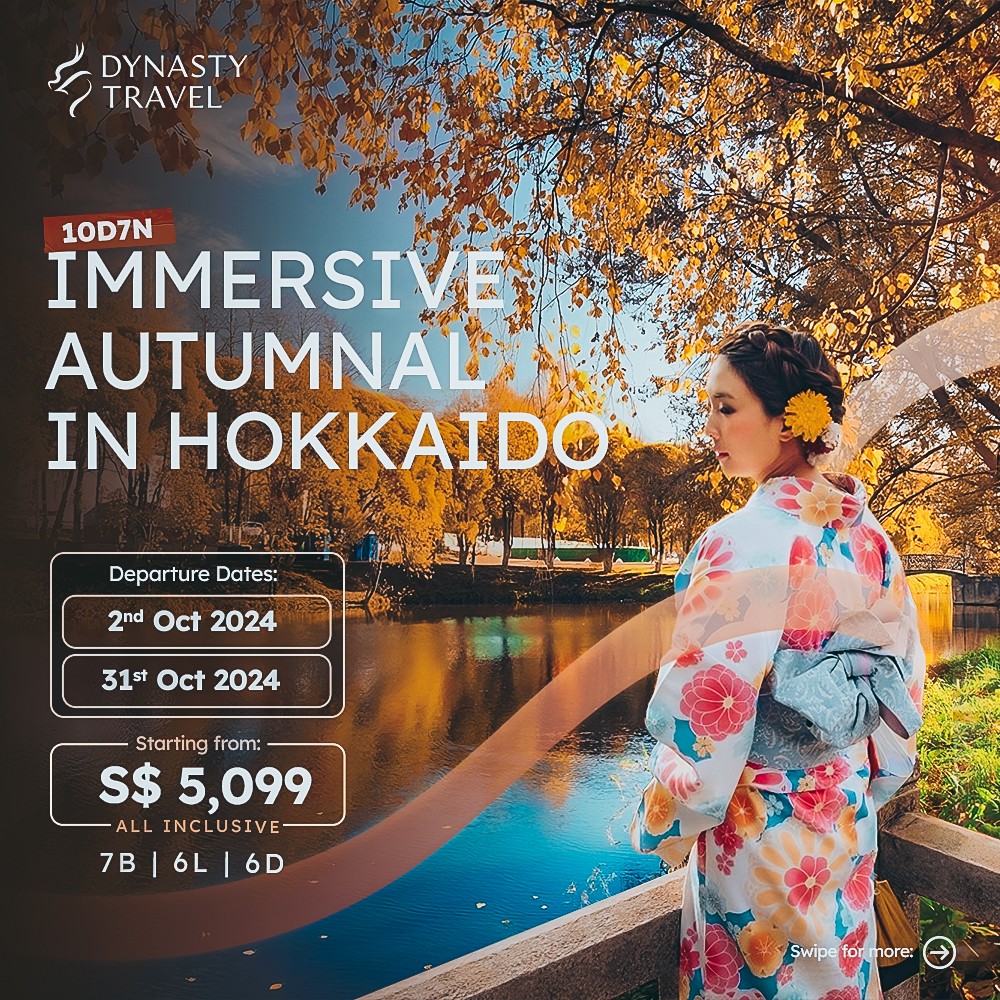
Dynasty's identity was built around the core idea of connecting people and places. But the visual execution on social wasn't reflecting that idea. Every post was a logo placed on a photo, and each destination on the carousel was just a set of disconnected images: a waterfall here, a village there, a glacier at the end. Nothing felt coherent, so nothing established a signature or a uniqueness that was specific to the brand.

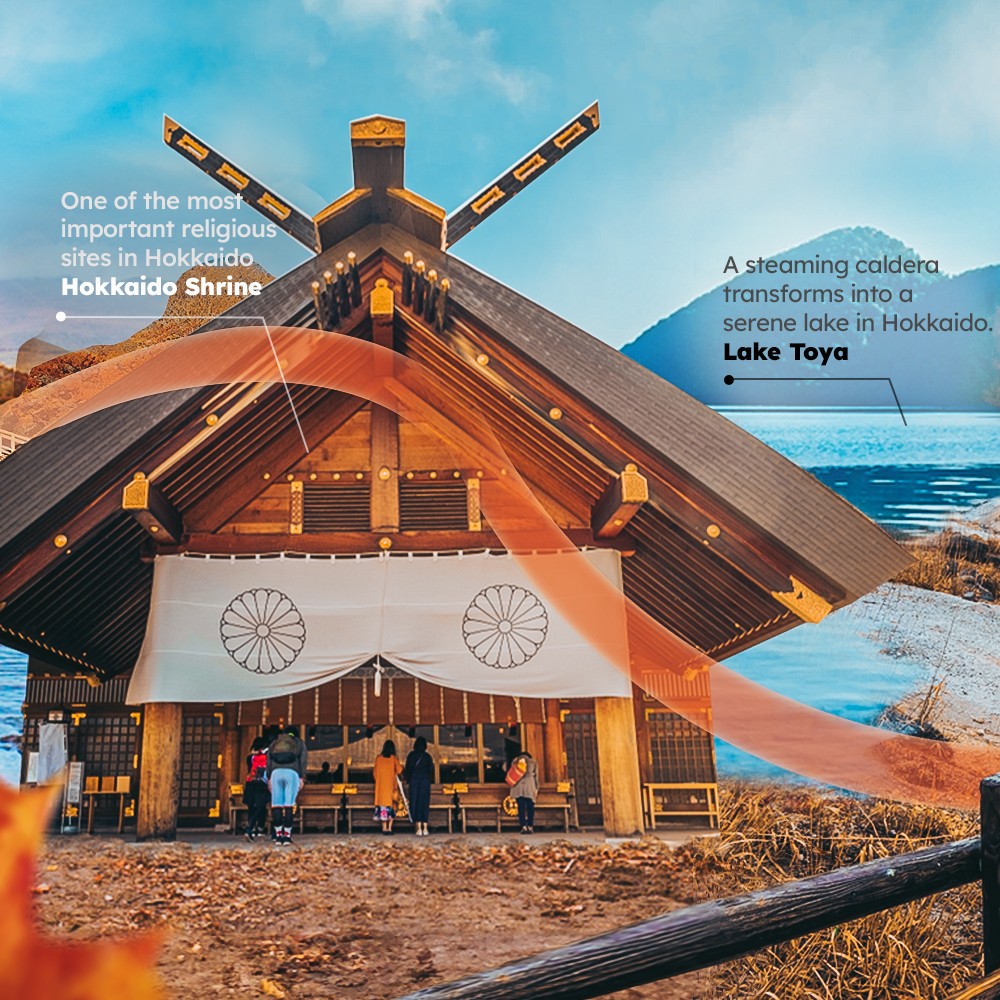
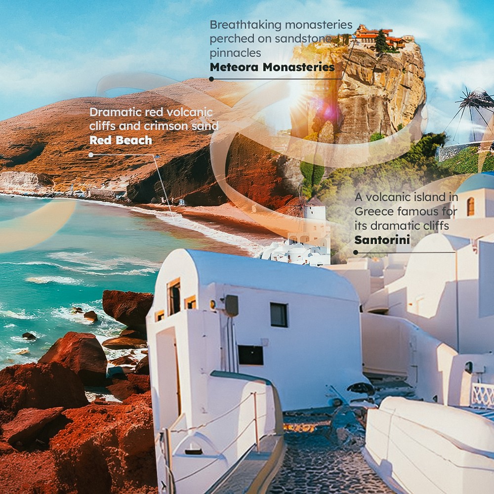
A trip is a sequence of places the customer gets to explore, but the itineraries and the promotional materials were piles of disconnected images. So I built each itinerary as one wide artwork made up of the main attractions that highlight that specific trip, with the line weaving in and out of the different places.

This approach not only brought visual cohesion to the posts but also transformed static content into dynamic stories that guided viewers through each journey, making the line a beautiful bridge between places and possibilities.

Scalable Identity System

Logo Variations

color palette

#823439

#823439

#823439

#823439

#823439

#823439

Tint & Shade

20% lightness increments

Typography

primary type face

Cooper Hewitt

Hierarchy & Weight

Aa

Thin

Aa

Regular

Aa

Semi-Bold

Aa

Heavy

Beyond the Feed

Once the line worked on Instagram, the natural next question was whether it could hold up in print. The covers were the first test, because a cover already has a headline, a logo and a photograph, with almost no room left over. So I let the line do the work, sweeping through as a single arc that wraps around the traveller and behind the type, which turns the cover into a moment inside a journey instead of a poster about one. Different destinations, same gesture, and the covers started to look like a family.

Collaterals

As a Project Lead, I owned the full pipeline from start to finish.

Creative Direction: Defining the visual language, layout, and overall site experience.

Client Management: Leading briefs, presenting concepts, and aligning on direction throughout.

Team Assembly: Sourcing and onboarding the Webflow developer and animator.

Production Oversight: Briefing the build team and ensuring designs translated correctly into Webflow.

Quality Assurance: Balancing visual ambition against site speed, making sure every interaction held up in the browser.

Beyond the Feed

Once the line worked on Instagram, the natural next question was whether it could hold up in print. The covers were the first test, because a cover already has a headline, a logo and a photograph, with almost no room left over. So I let the line do the work, sweeping through as a single arc that wraps around the traveller and behind the type, which turns the cover into a moment inside a journey instead of a poster about one. Different destinations, same gesture, and the covers started to look like a family.

The Prints

The inside pages were the harder problem. A tour booklet is dense by nature: itinerary listings, departure dates, prices, route maps, and dozens of small photos all competing for the same spread. The line became the structure that held it together, running across the page to tie the map to the listings and the listings to the photographs, so a spread full of information still reads as one trip rather than a table of options. It gave the books a rhythm that carried from page to page and from destination to destination.

Collaterals

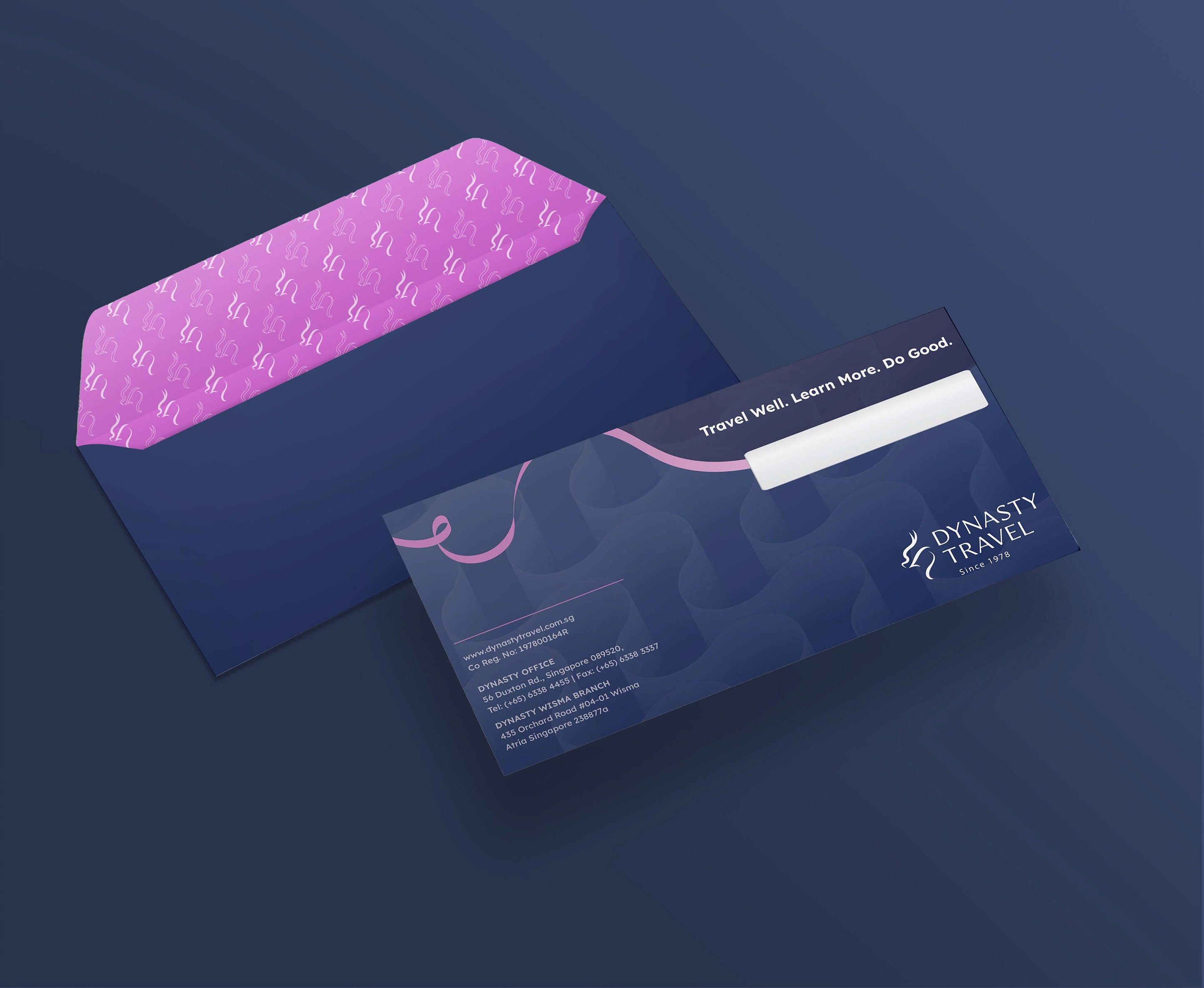
The vouchers and envelopes were where the idea really got tested, because there is nowhere to hide on a piece that small. A gift voucher is a boarding pass sized rectangle carrying a value, a serial number and the terms, and an envelope is mostly empty space with an address on it. The line runs edge to edge across both, curling around the tagline on the envelope and threading behind the numbers on the voucher, and at that size it is the line, not the logo, that tells you whose it is. By then it had stopped being a campaign element and become the thing that makes a Dynasty piece recognisable before anyone reads a word.

Beyond the Feed

Once the line worked on Instagram, the natural next question was whether it could hold up in print. The covers were the first test, because a cover already has a headline, a logo and a photograph, with almost no room left over. So I let the line do the work, sweeping through as a single arc that wraps around the traveller and behind the type, which turns the cover into a moment inside a journey instead of a poster about one. Different destinations, same gesture, and the covers started to look like a family.

The inside pages were the harder problem. A tour booklet is dense by nature: itinerary listings, departure dates, prices, route maps, and dozens of small photos all competing for the same spread. The line became the structure that held it together, running across the page to tie the map to the listings and the listings to the photographs, so a spread full of information still reads as one trip rather than a table of options. It gave the books a rhythm that carried from page to page and from destination to destination.

The vouchers and envelopes were where the idea really got tested, because there is nowhere to hide on a piece that small. A gift voucher is a boarding pass sized rectangle carrying a value, a serial number and the terms, and an envelope is mostly empty space with an address on it. The line runs edge to edge across both, curling around the tagline on the envelope and threading behind the numbers on the voucher, and at that size it is the line, not the logo, that tells you whose it is. By then it had stopped being a campaign element and become the thing that makes a Dynasty piece recognisable before anyone reads a word.

How I Built It

How I Built It

logo in use

logo in use

final thoughts

Have a project in mind?